BENNY BUN BURGERS Branding Project
Description
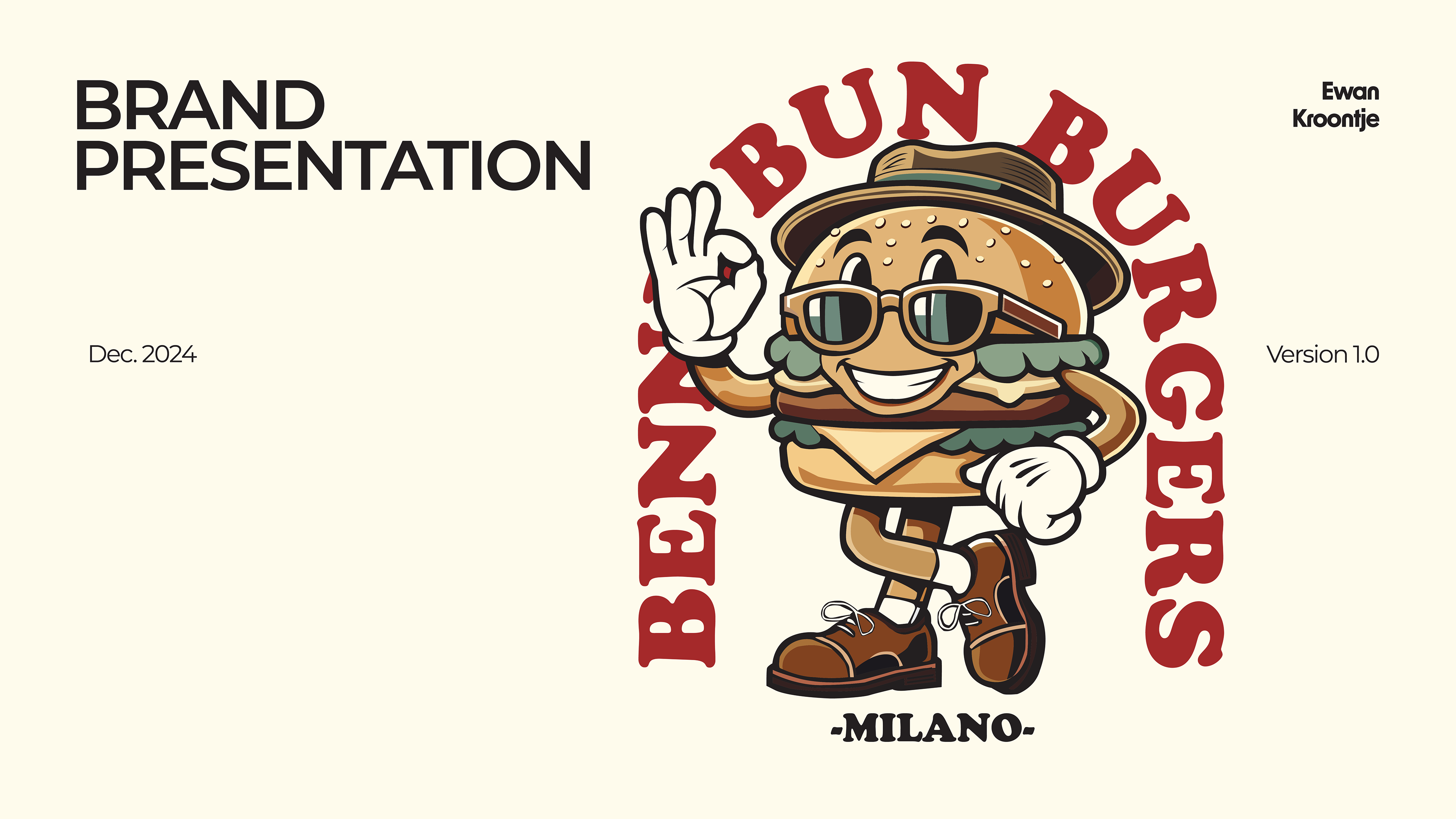
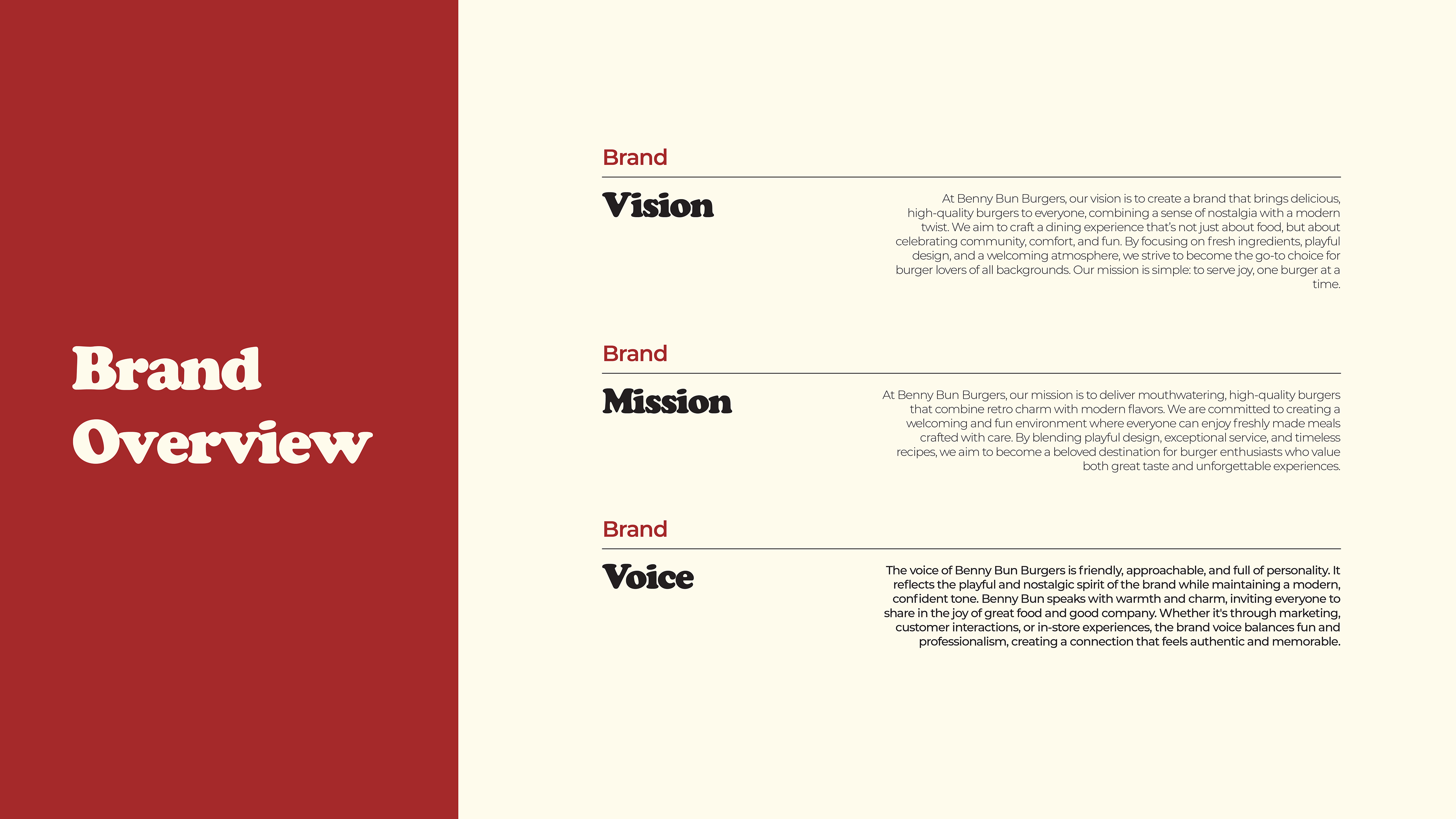
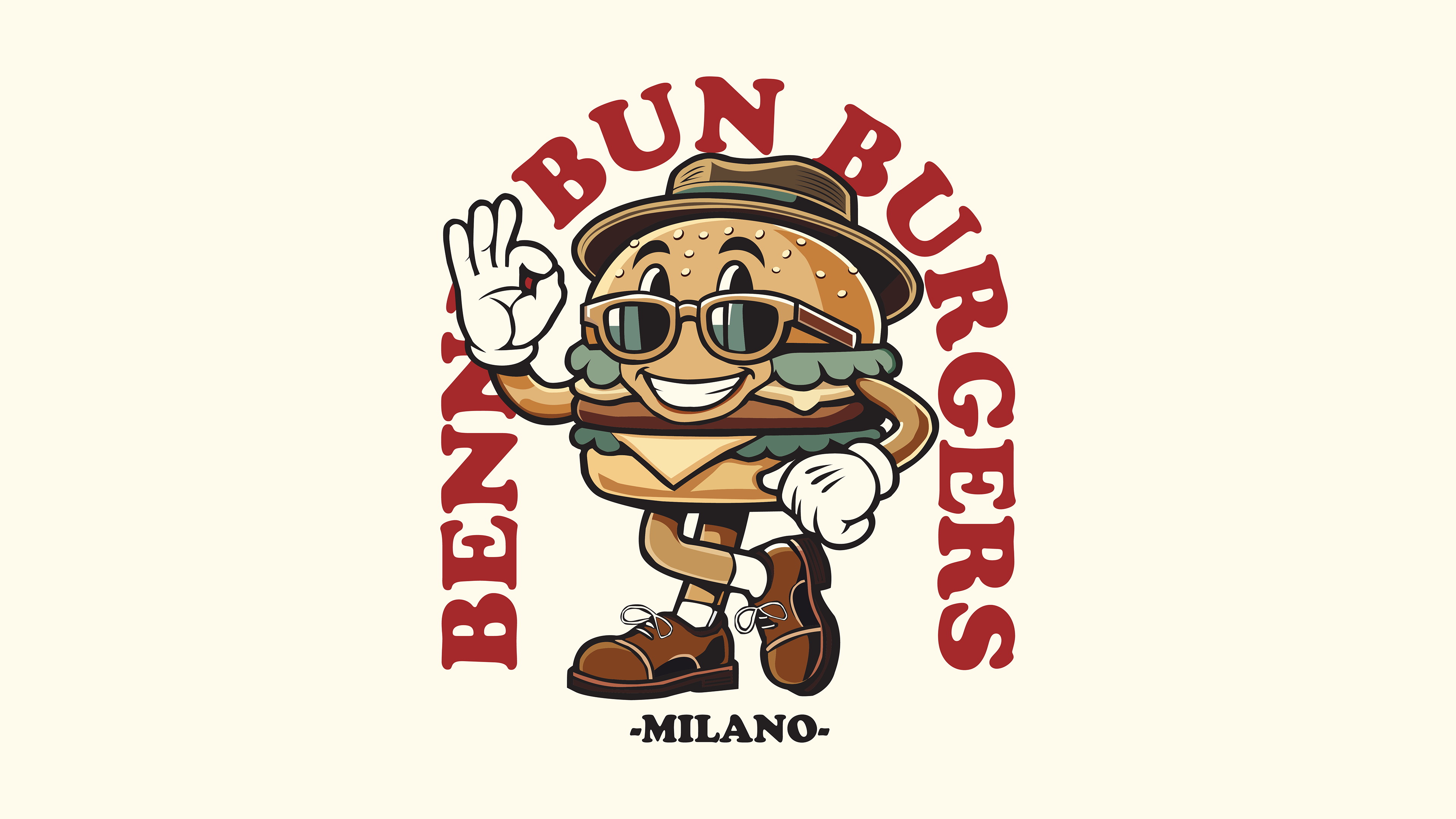
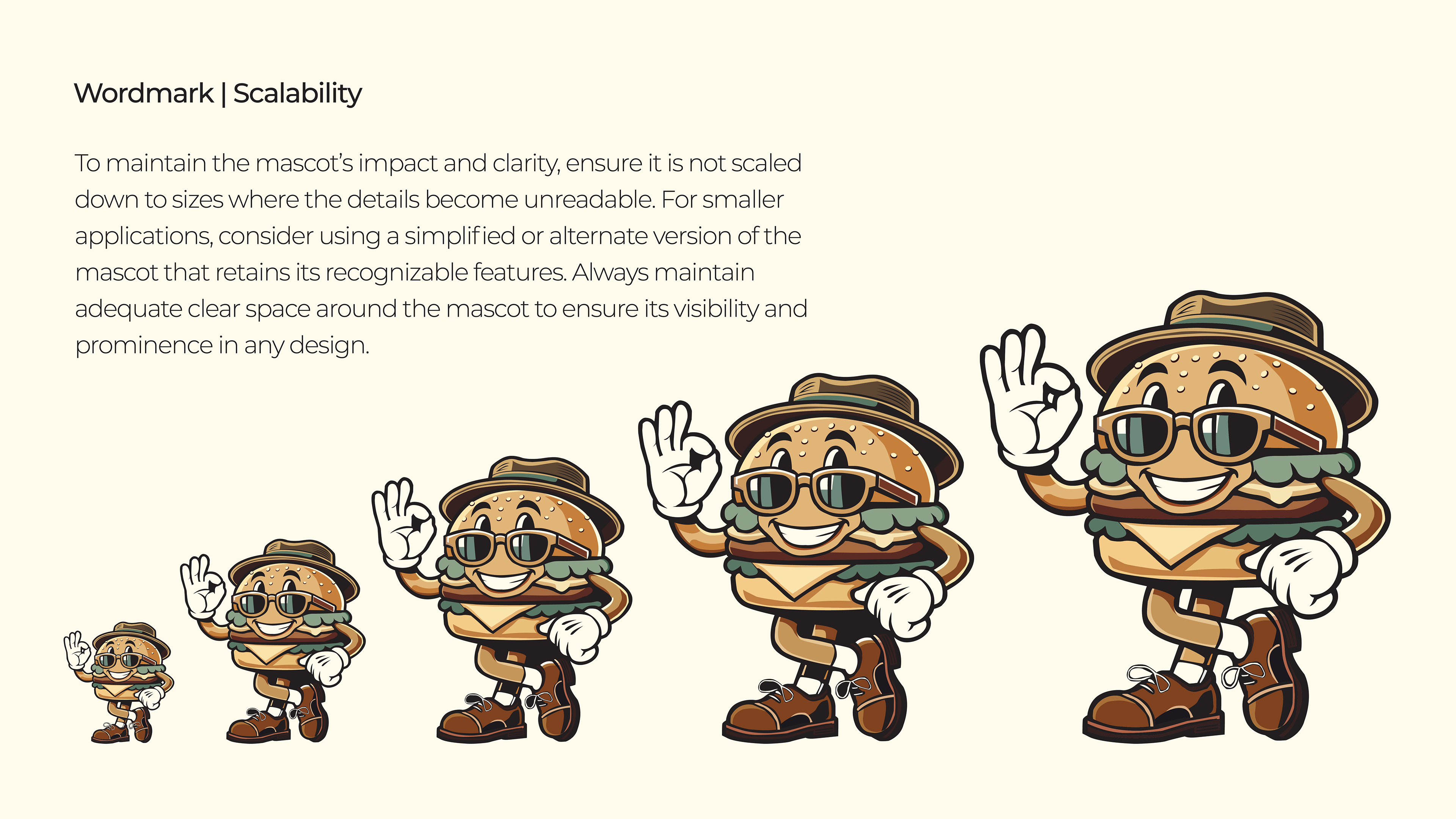
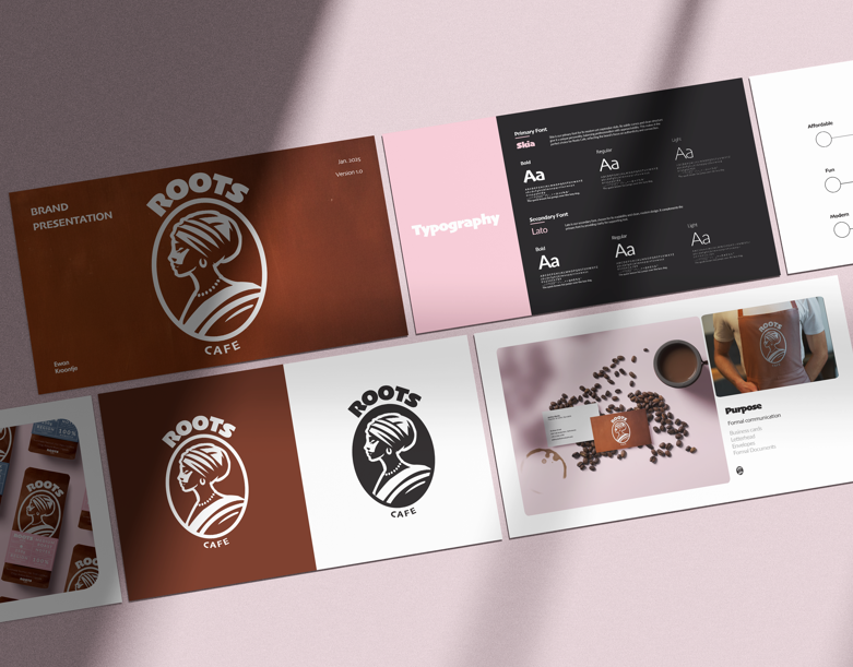
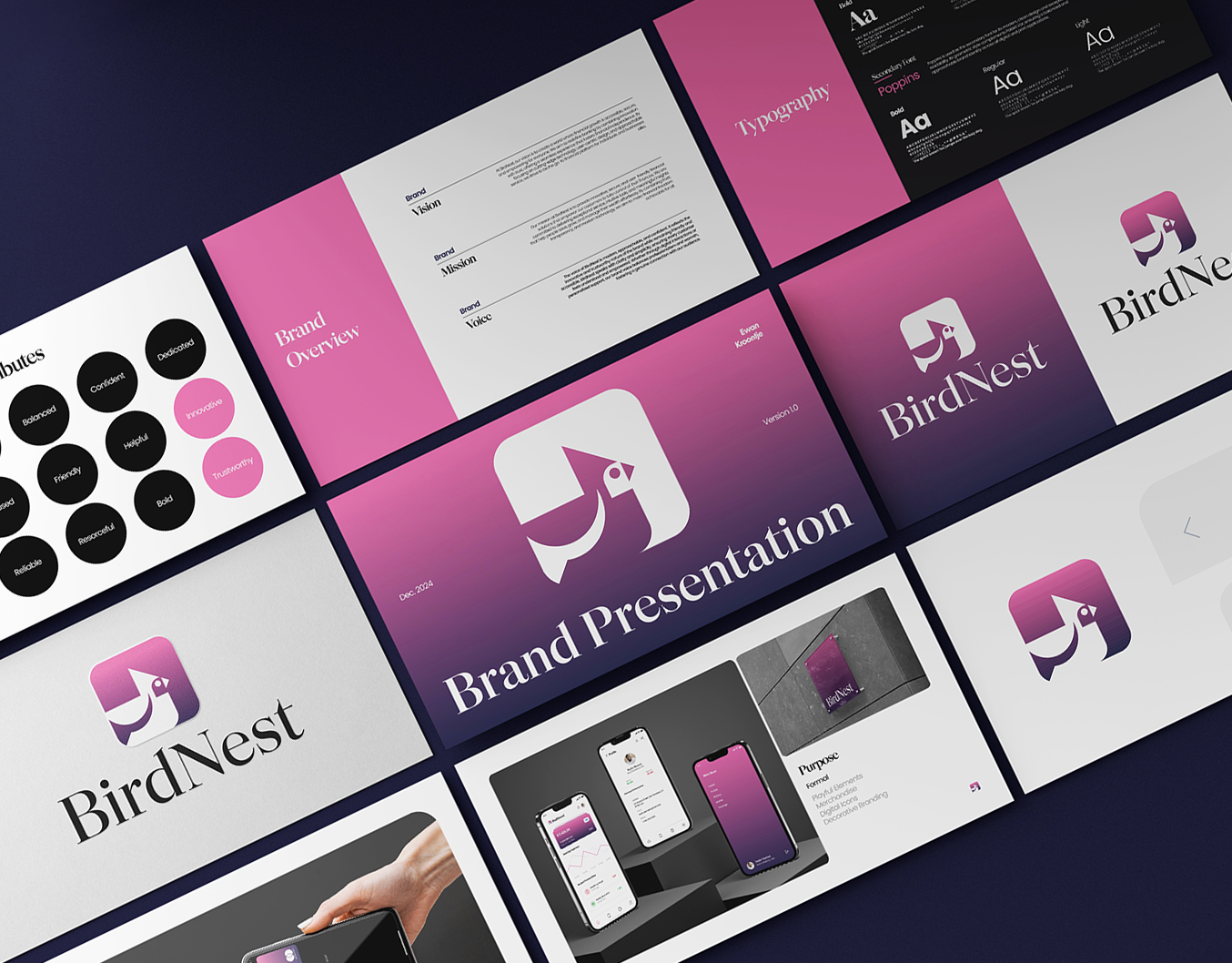
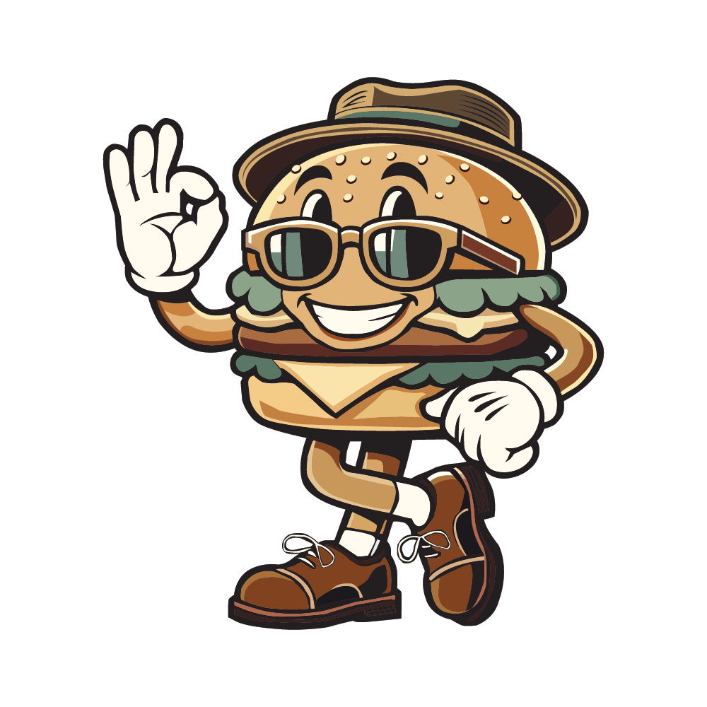
The Benny Bun Burgers branding project is a creative exploration of blending retro design with modern aesthetics, brought to life through its playful mascot, Benny Bun, as the centerpiece of the logo. Inspired by the nostalgic charm of vintage diners and infused with contemporary design principles, this project challenges traditional burger branding by creating a visual identity that is bold, approachable, and timeless.
Concept
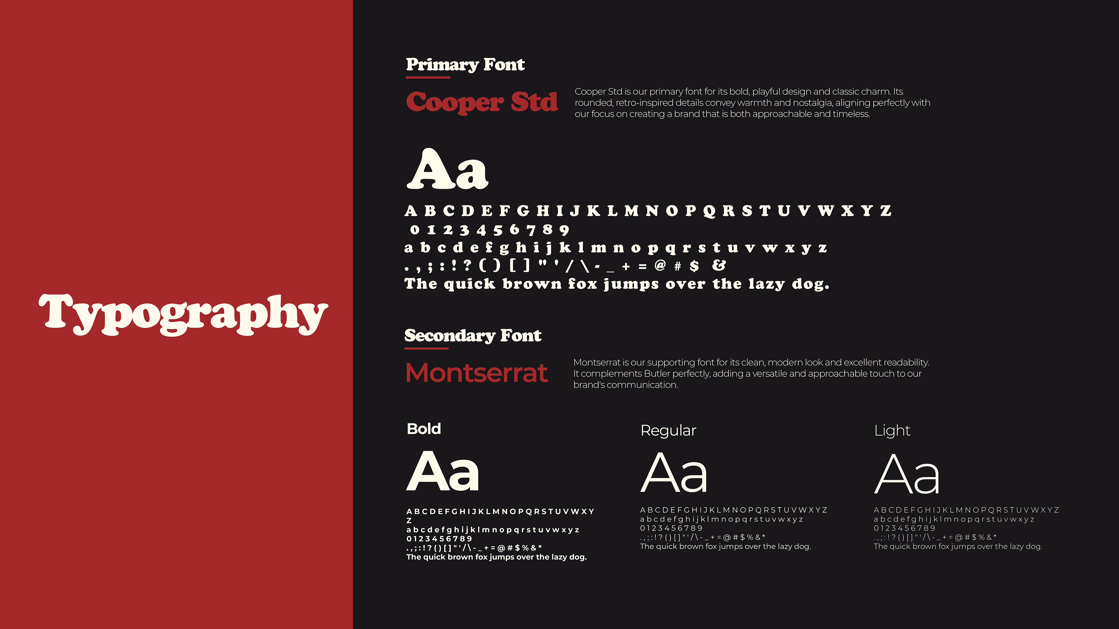
At the heart of this branding is the seamless integration of the beloved Benny Bun mascot with bold, type-driven design. The visual identity combines the friendly and retro vibe of Cooper Black, used for the primary logo font, with the clean and versatile Montserrat for supporting text. The Benny Bun mascot acts as the face of the brand, embodying its welcoming and playful spirit. This pairing of retro-inspired typography and modern elements highlights the brand’s mission to celebrate tradition while appealing to contemporary tastes.
Key Deliverables
• Logo System:
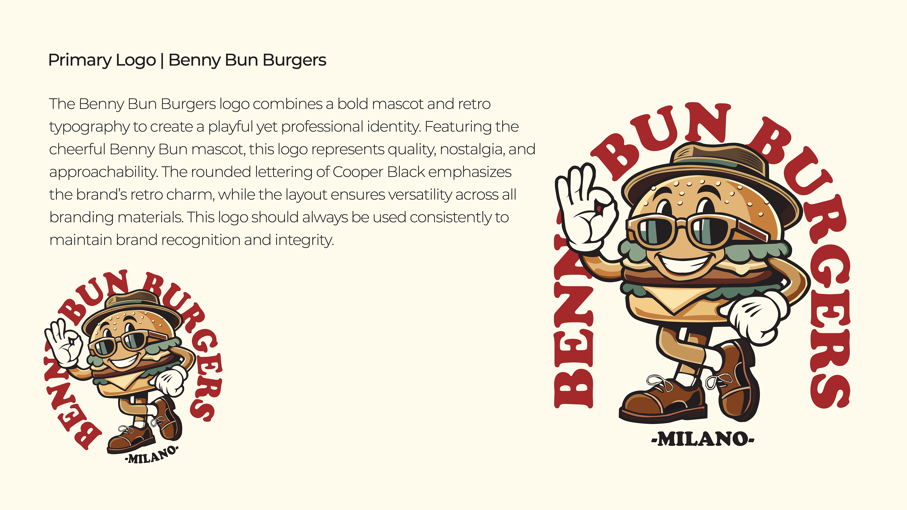
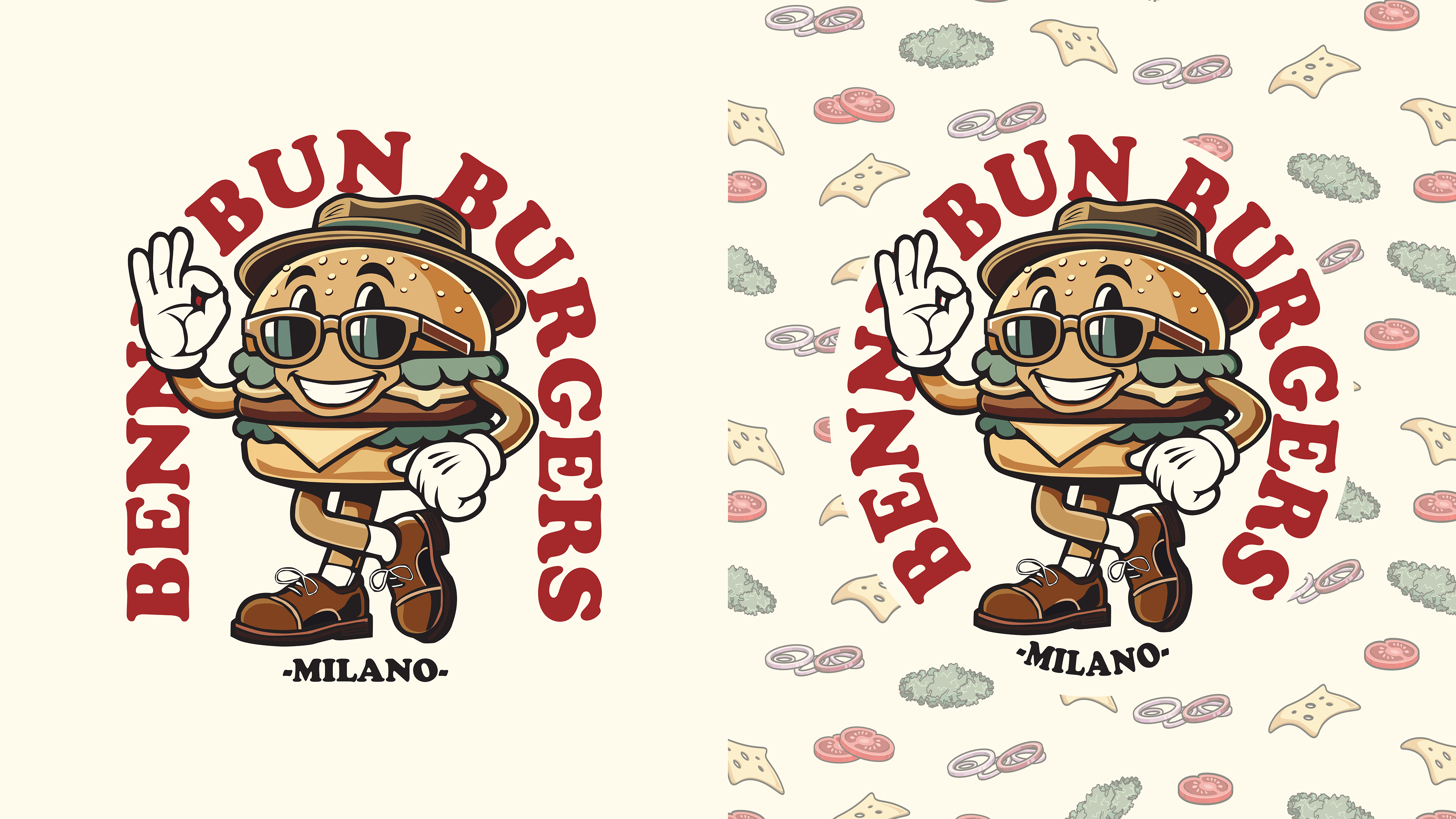
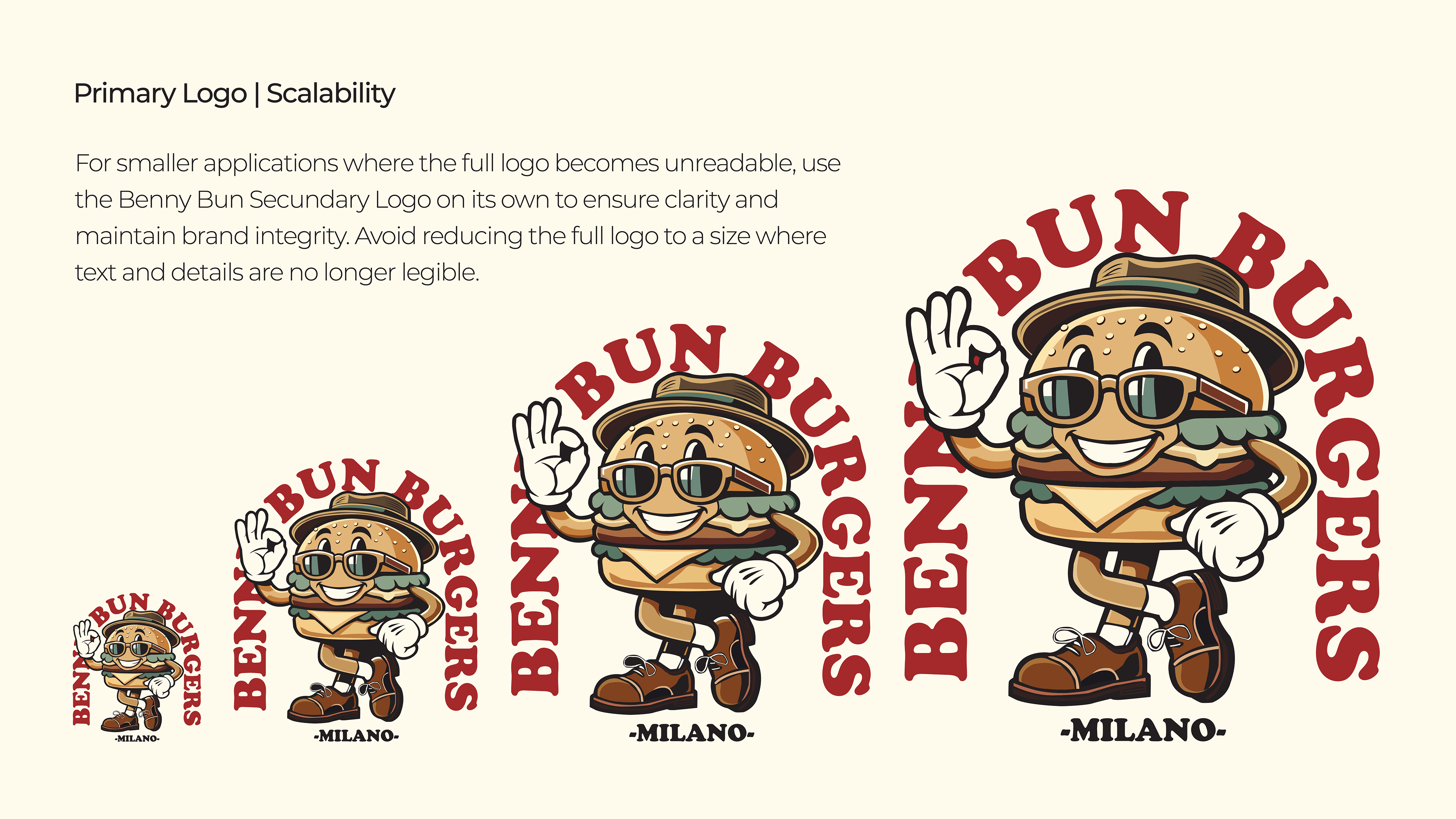
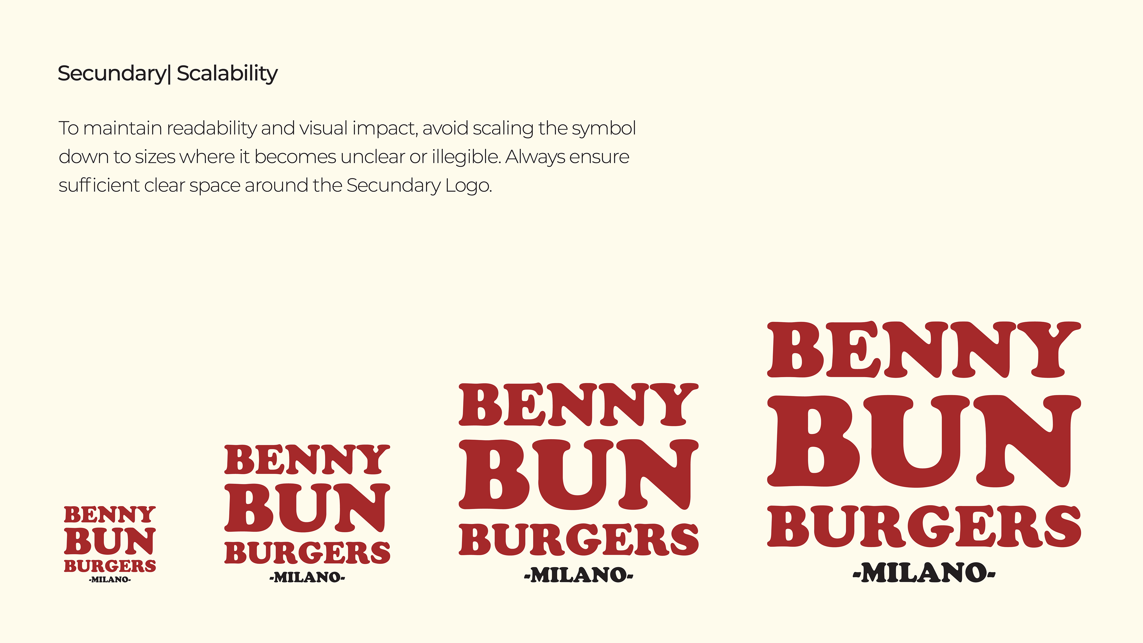
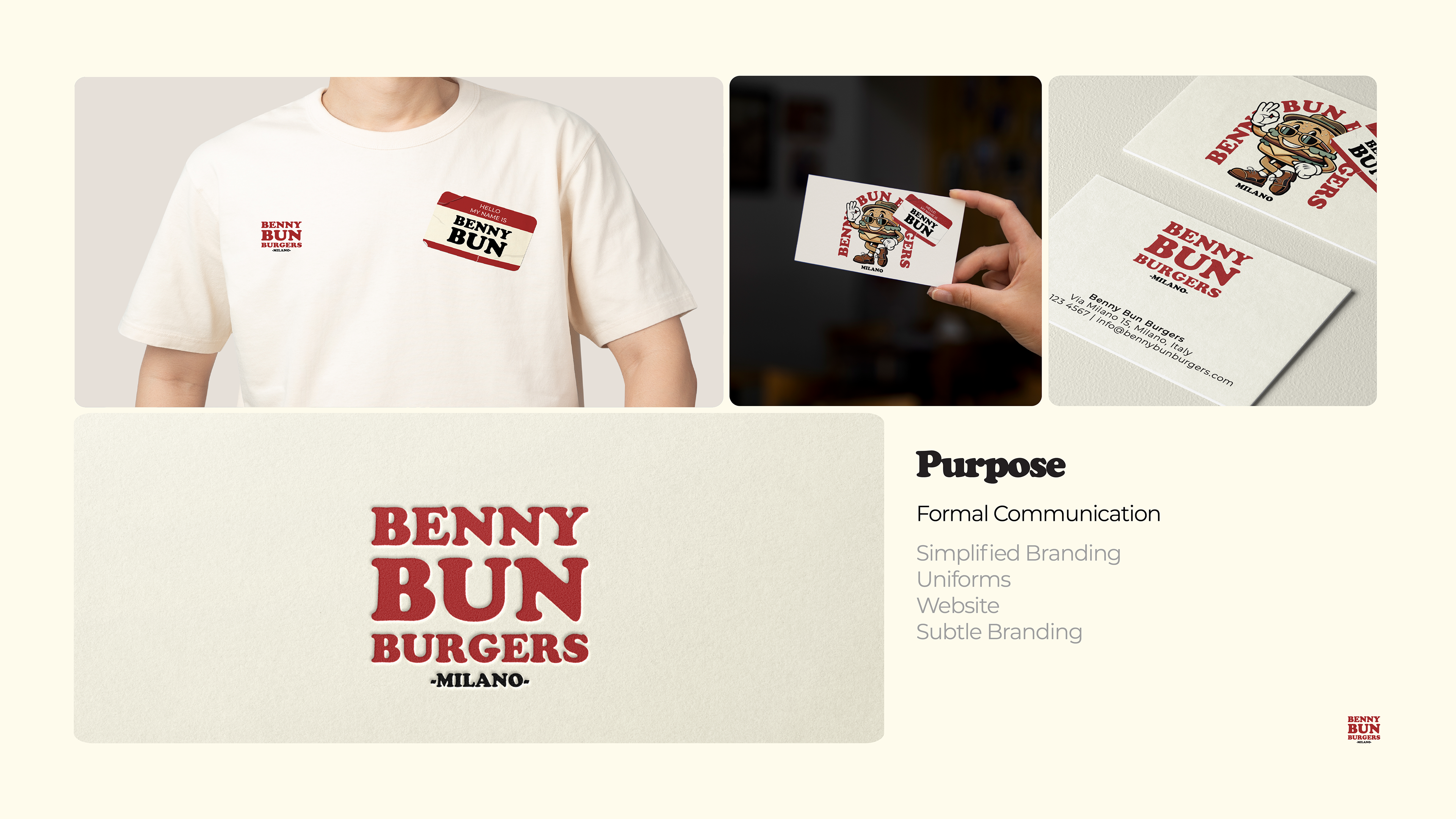
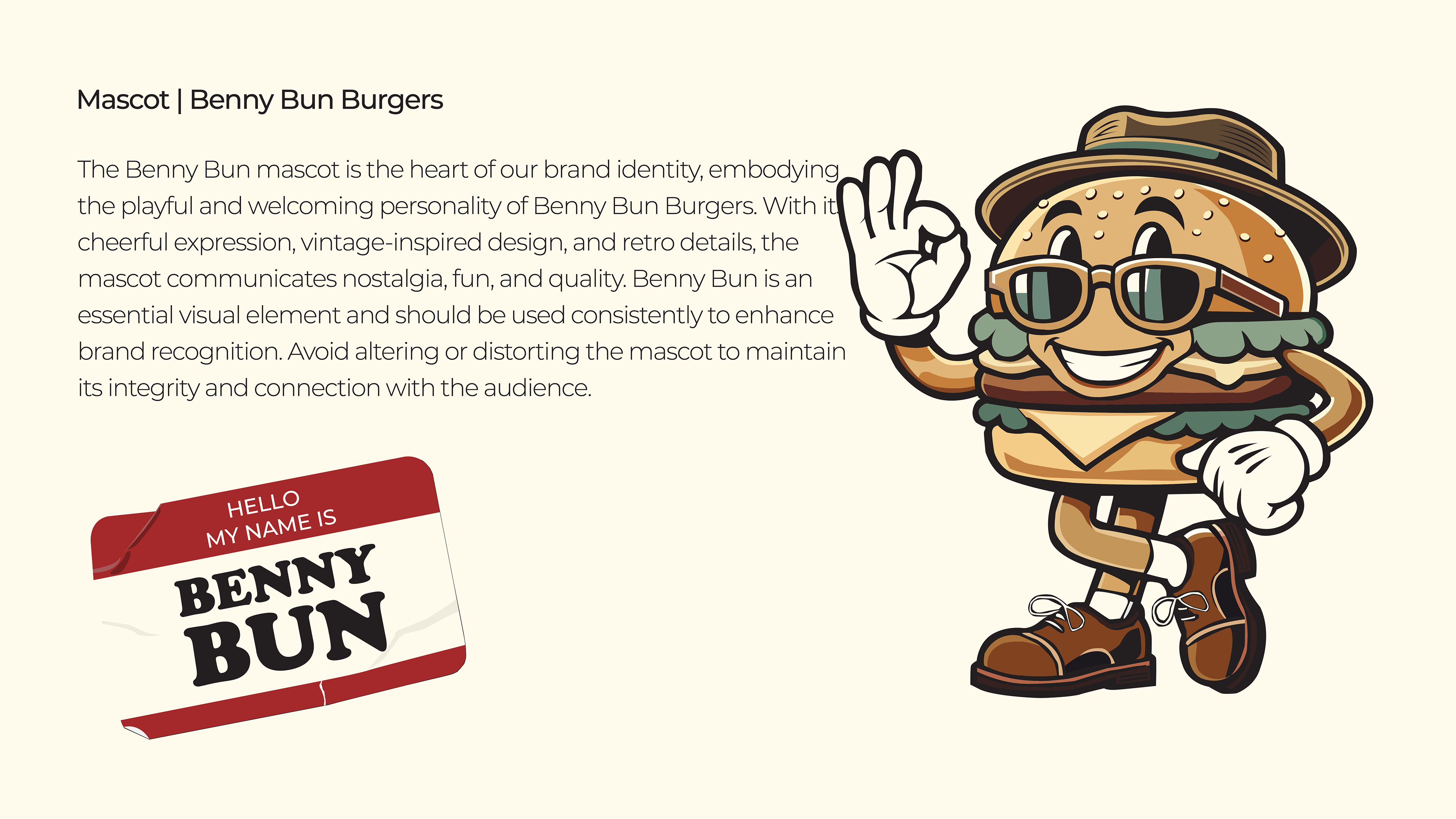
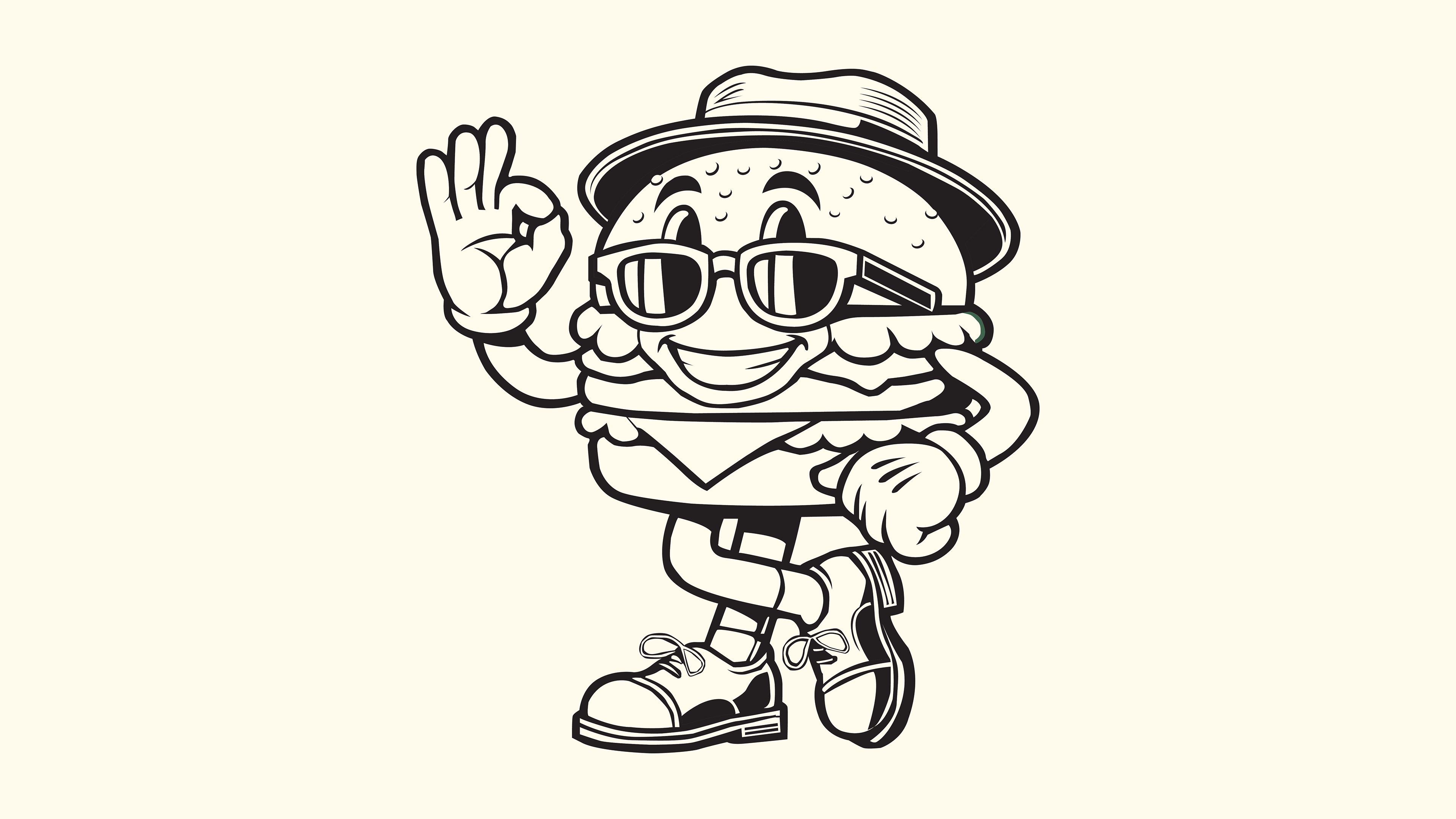
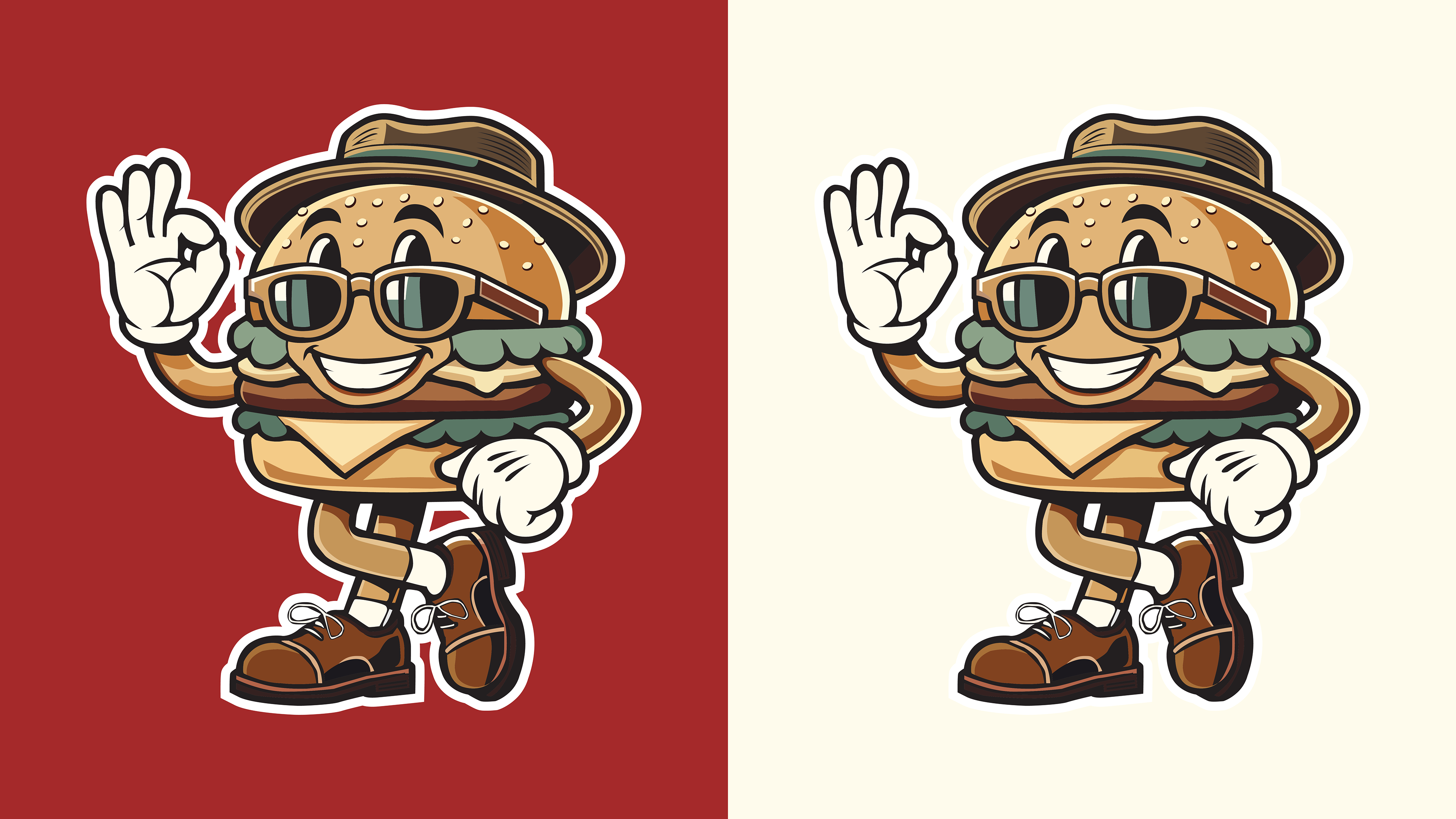
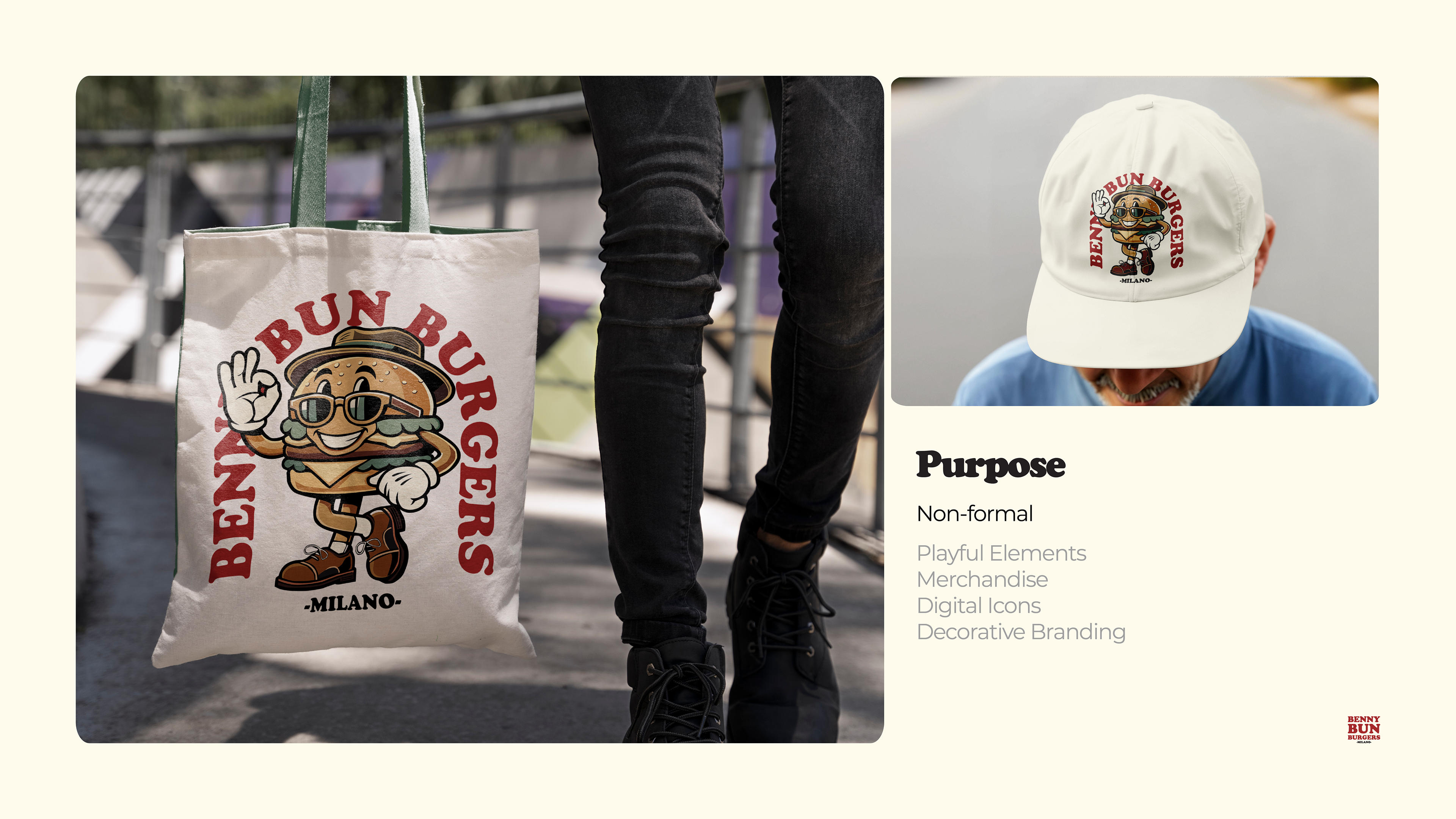
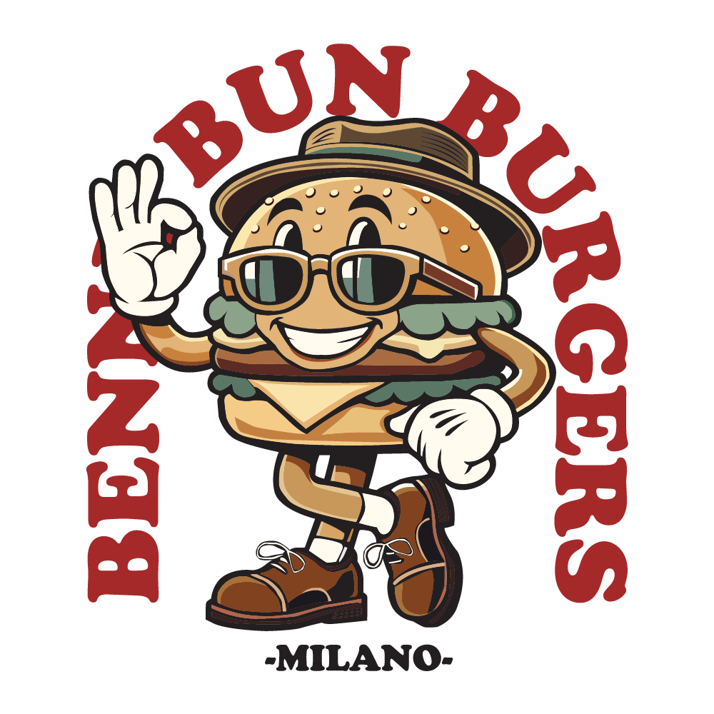
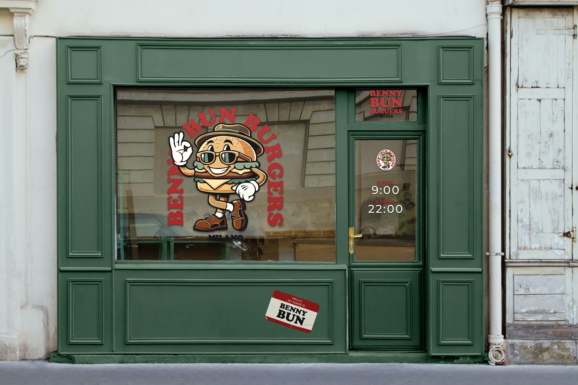
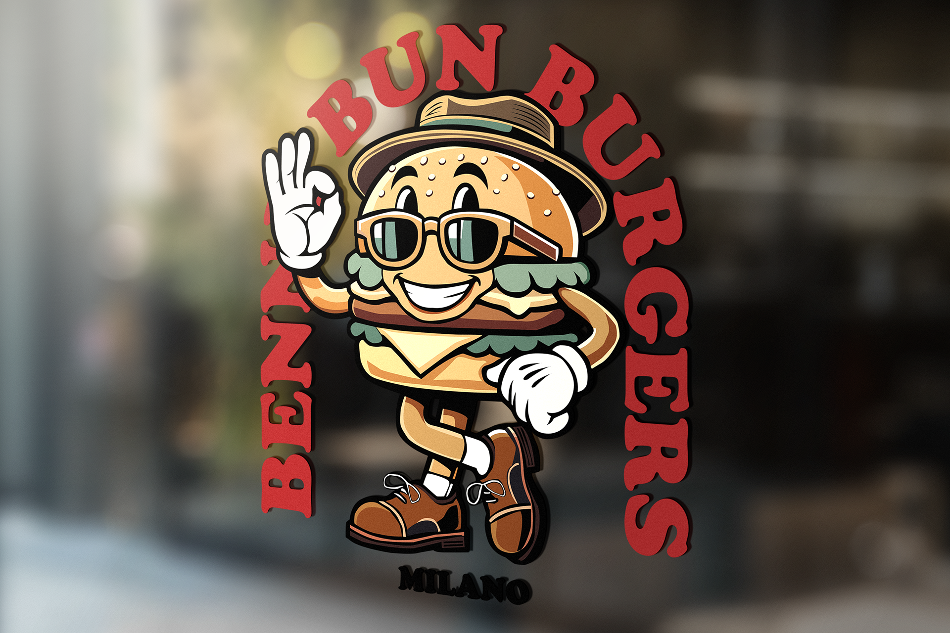
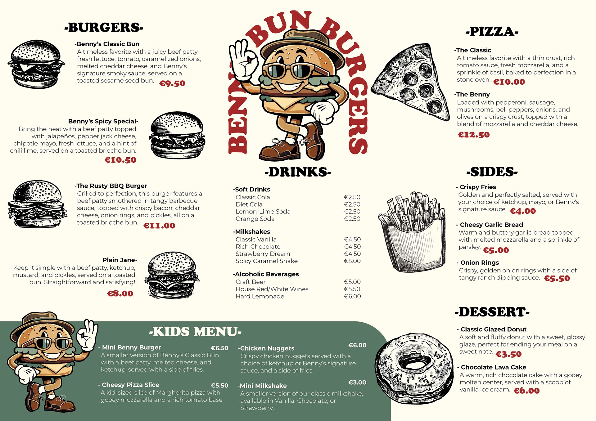
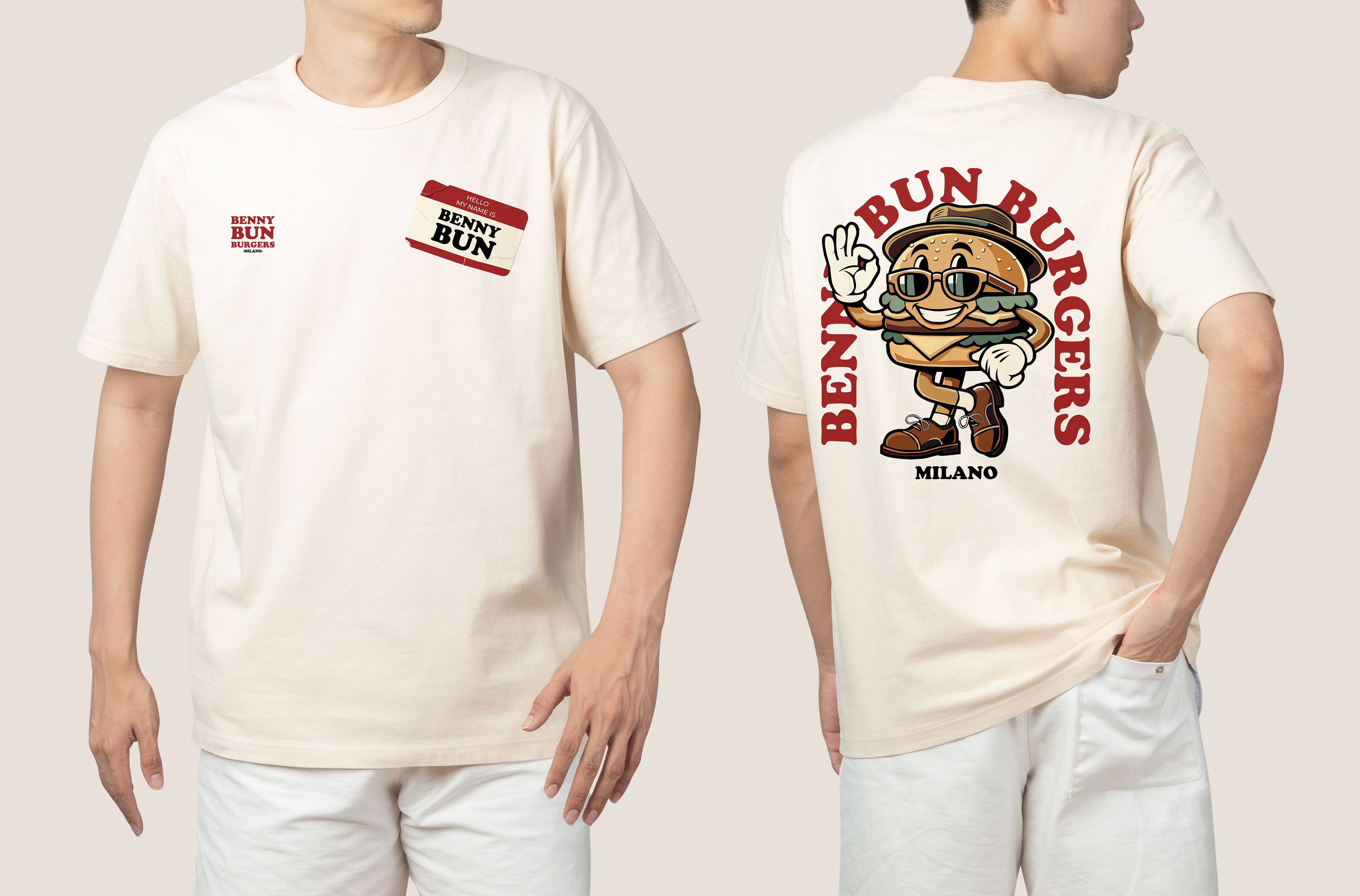
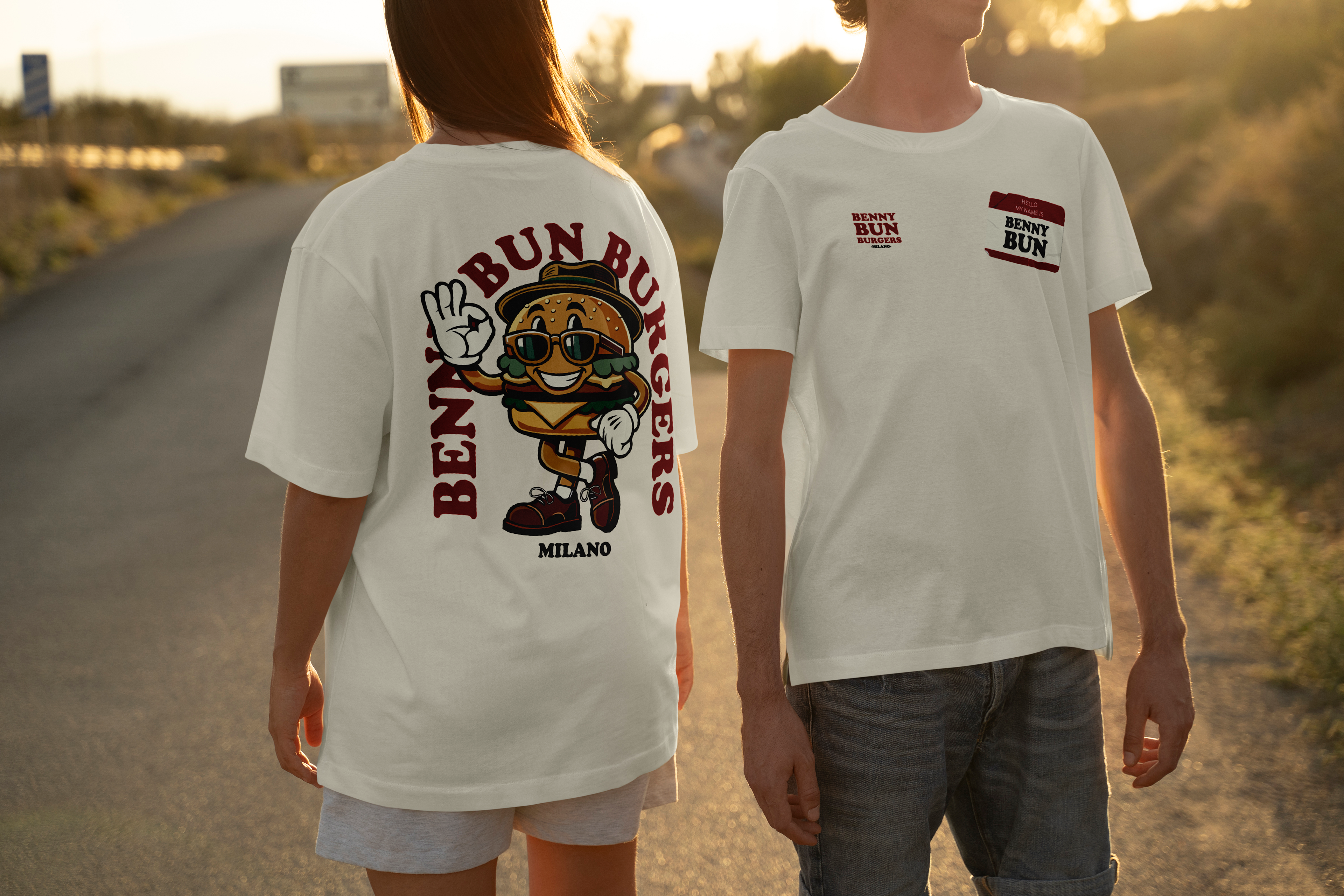
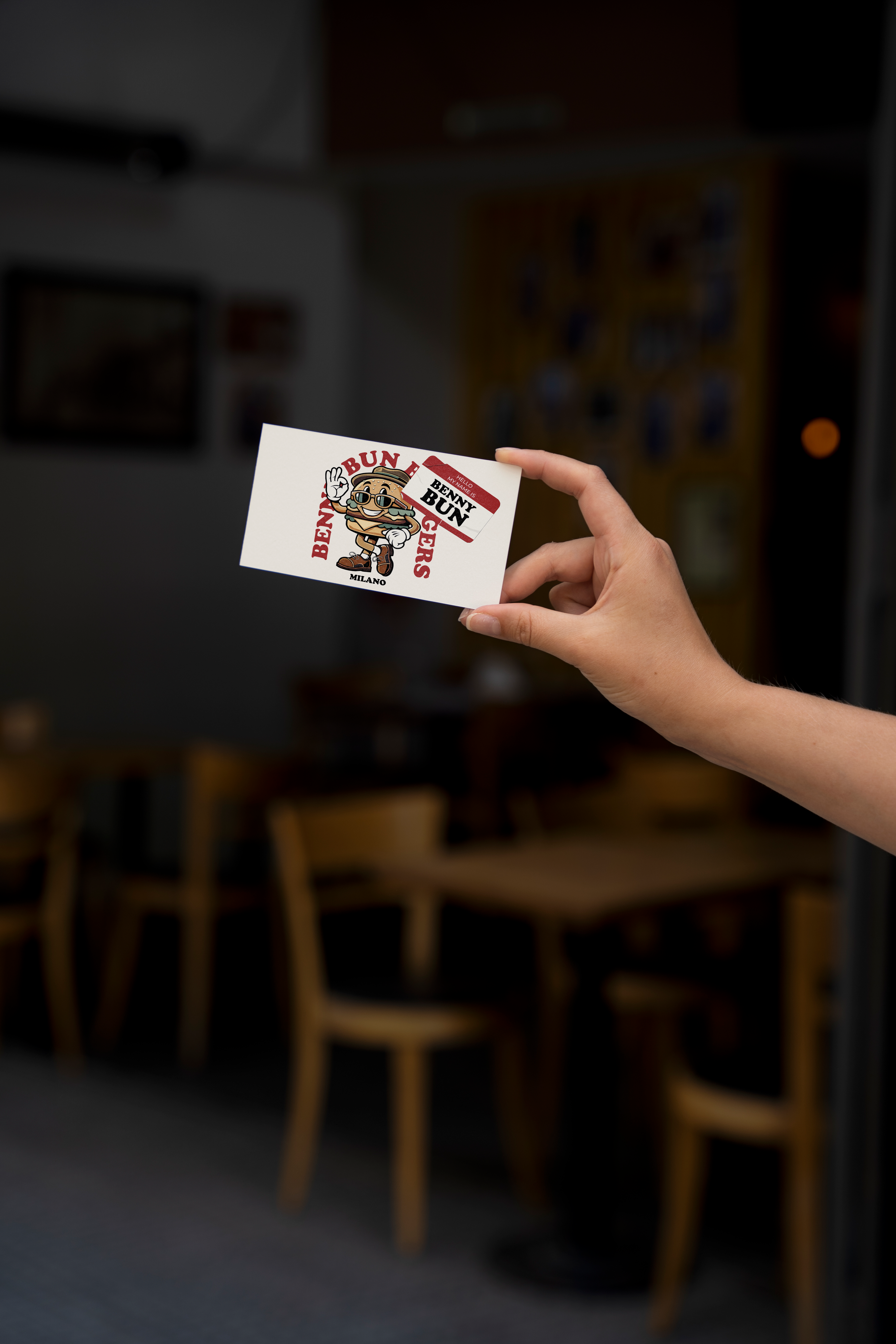
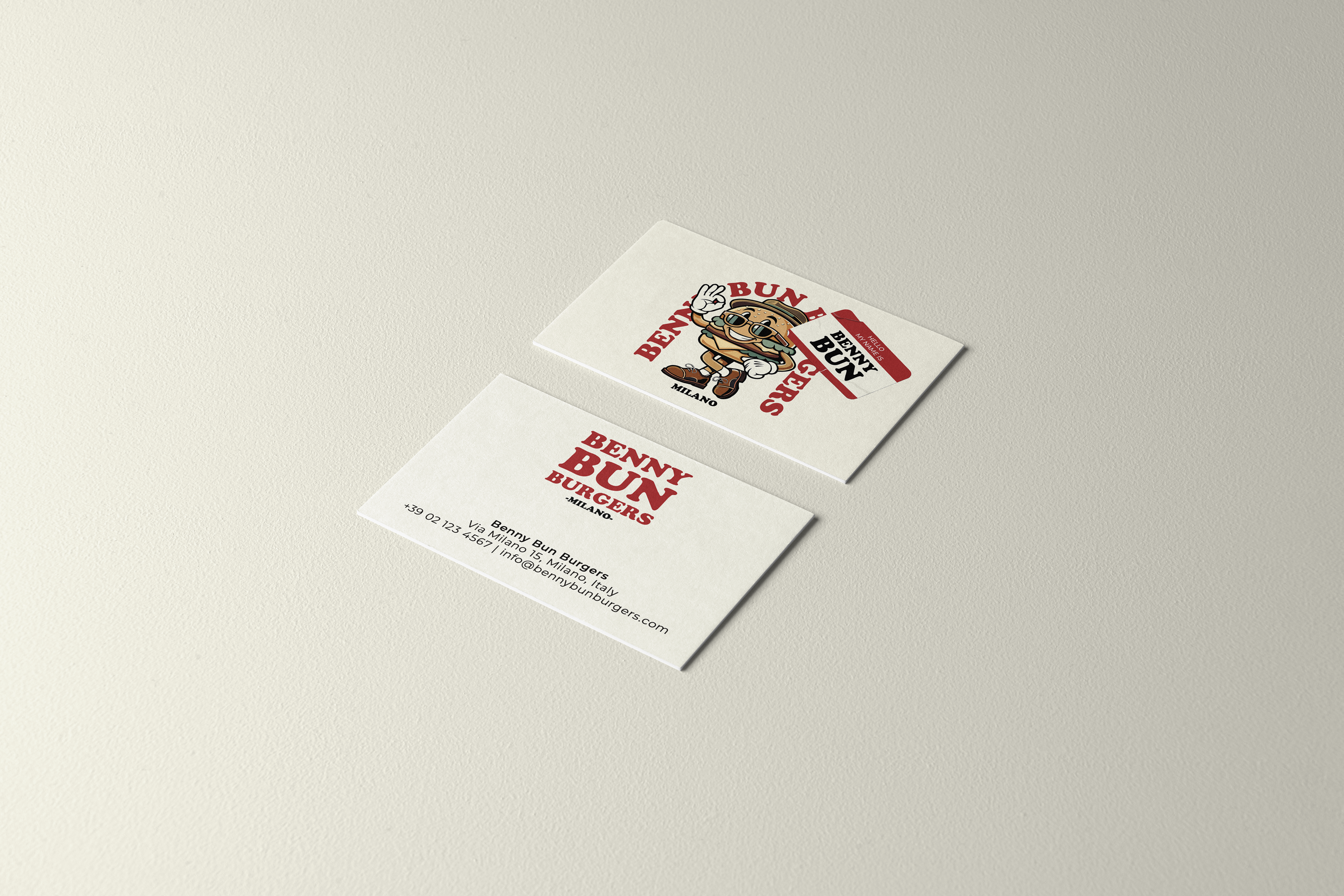
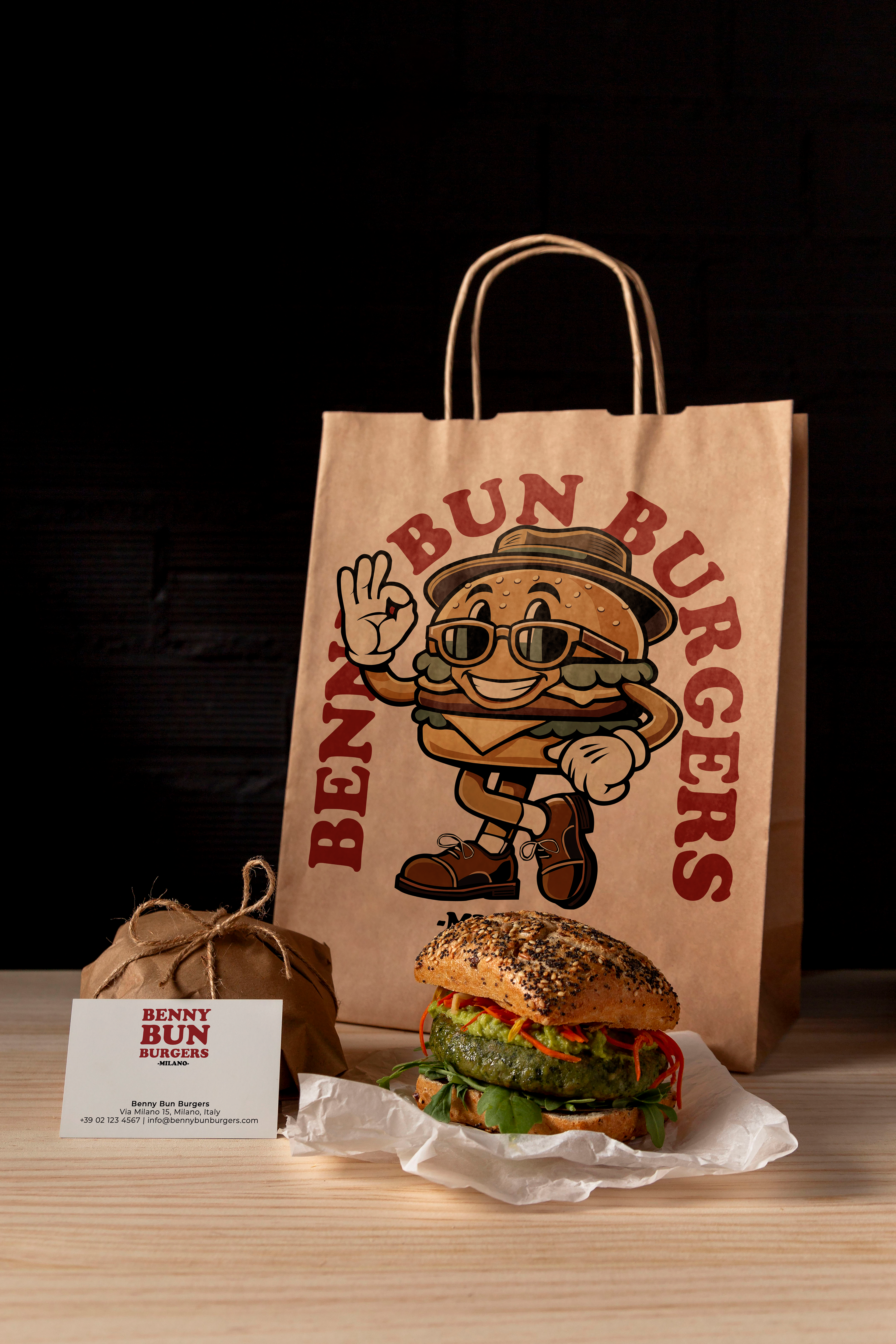
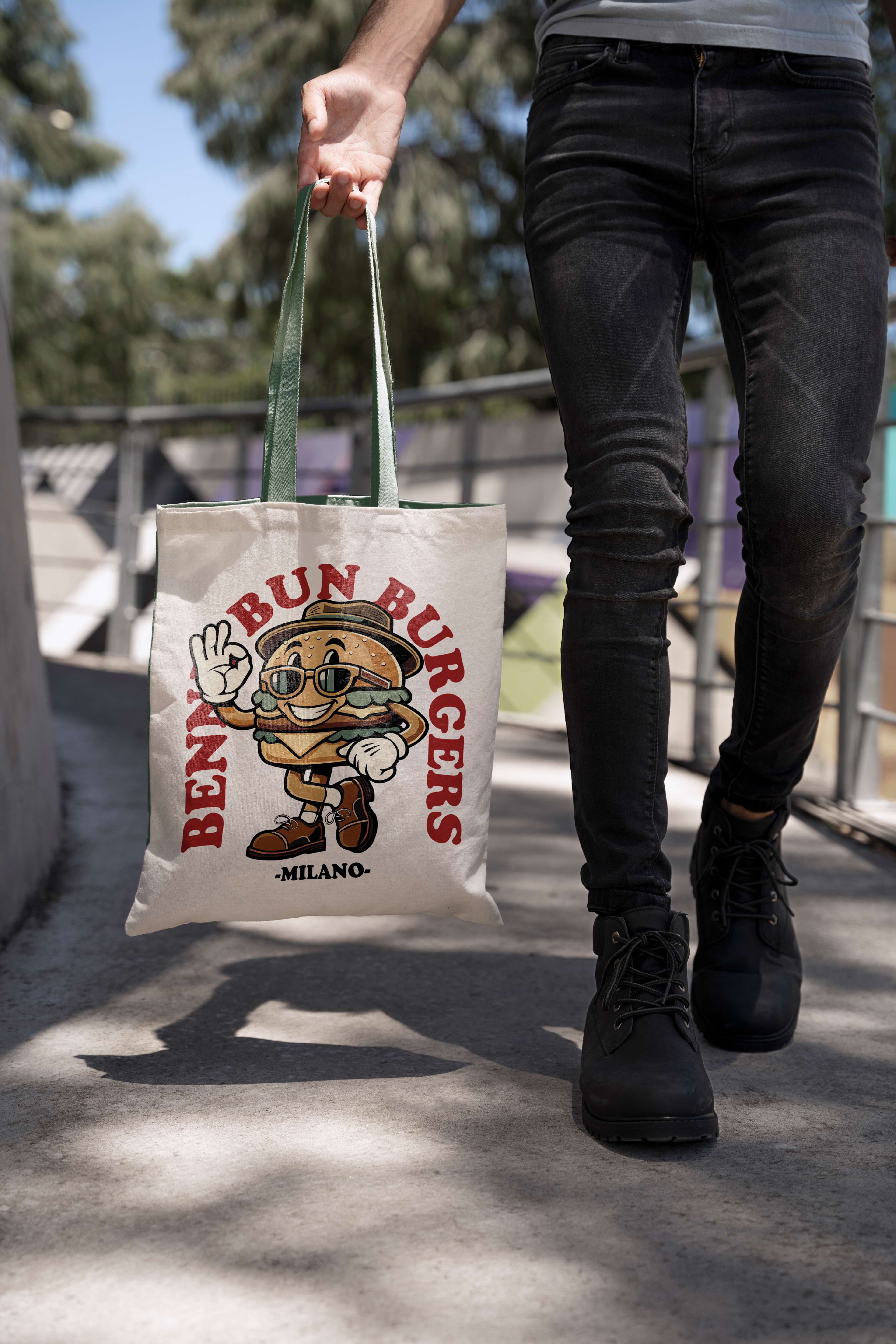
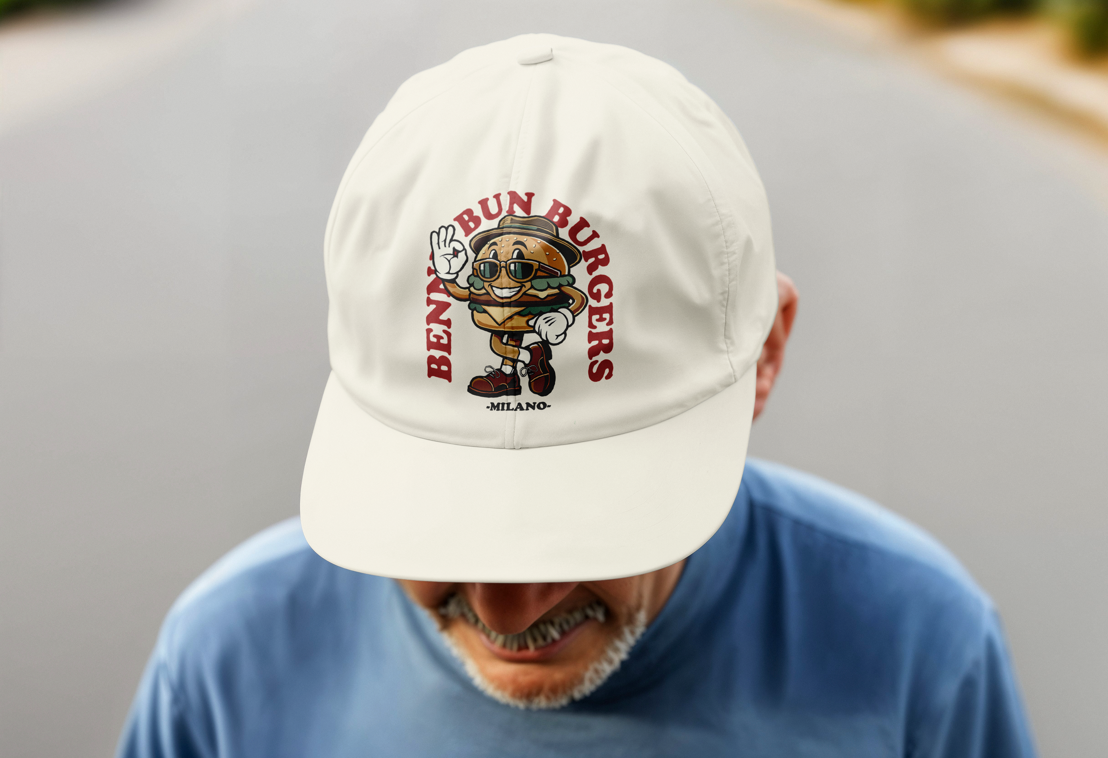
The logo prominently features Benny Bun, a charming burger mascot with a retro personality, surrounded by bold Cooper Black typography. The design is accented with geometric shapes and vintage-inspired elements to evoke a classic diner feel.
• Typography:
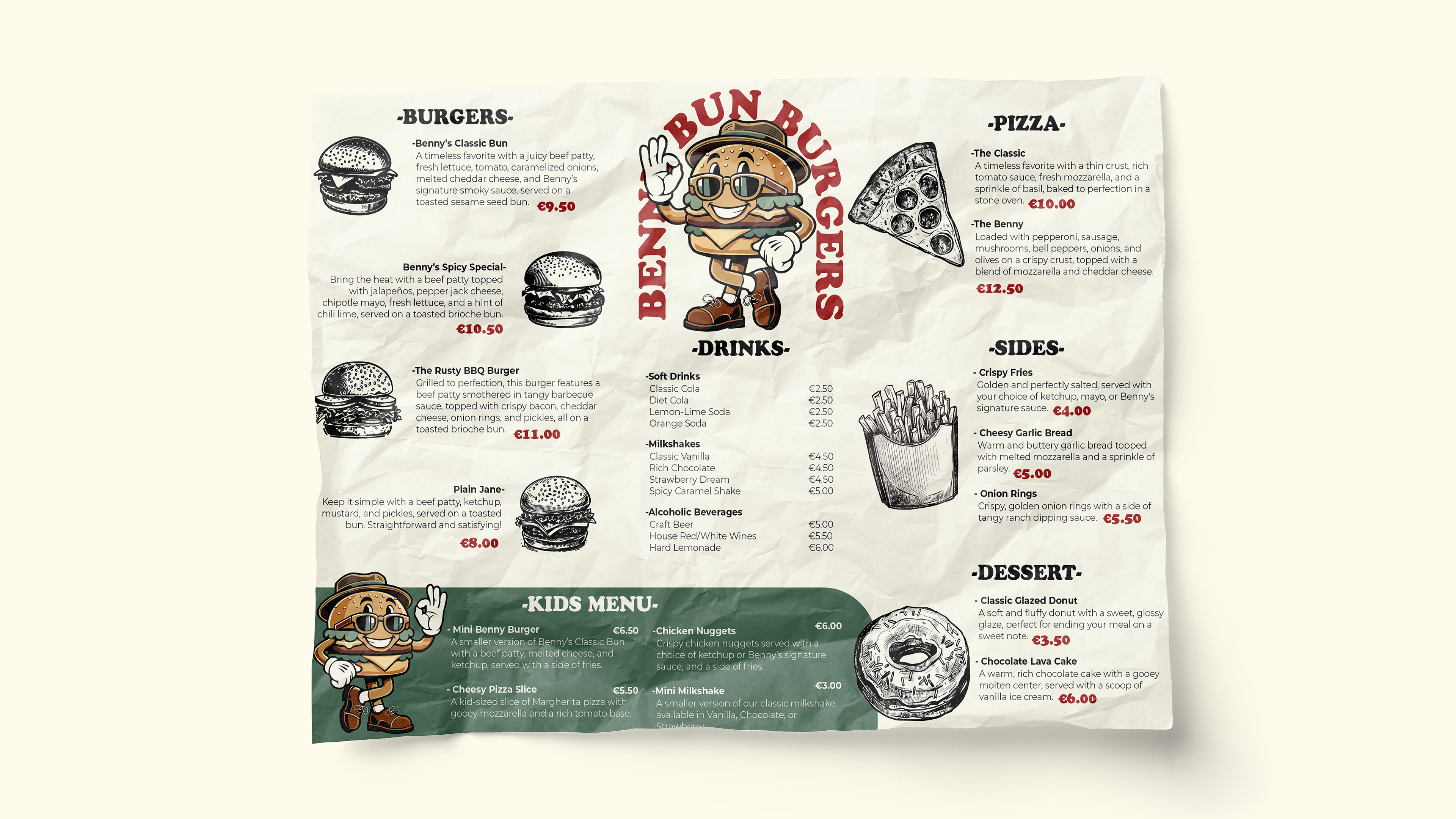
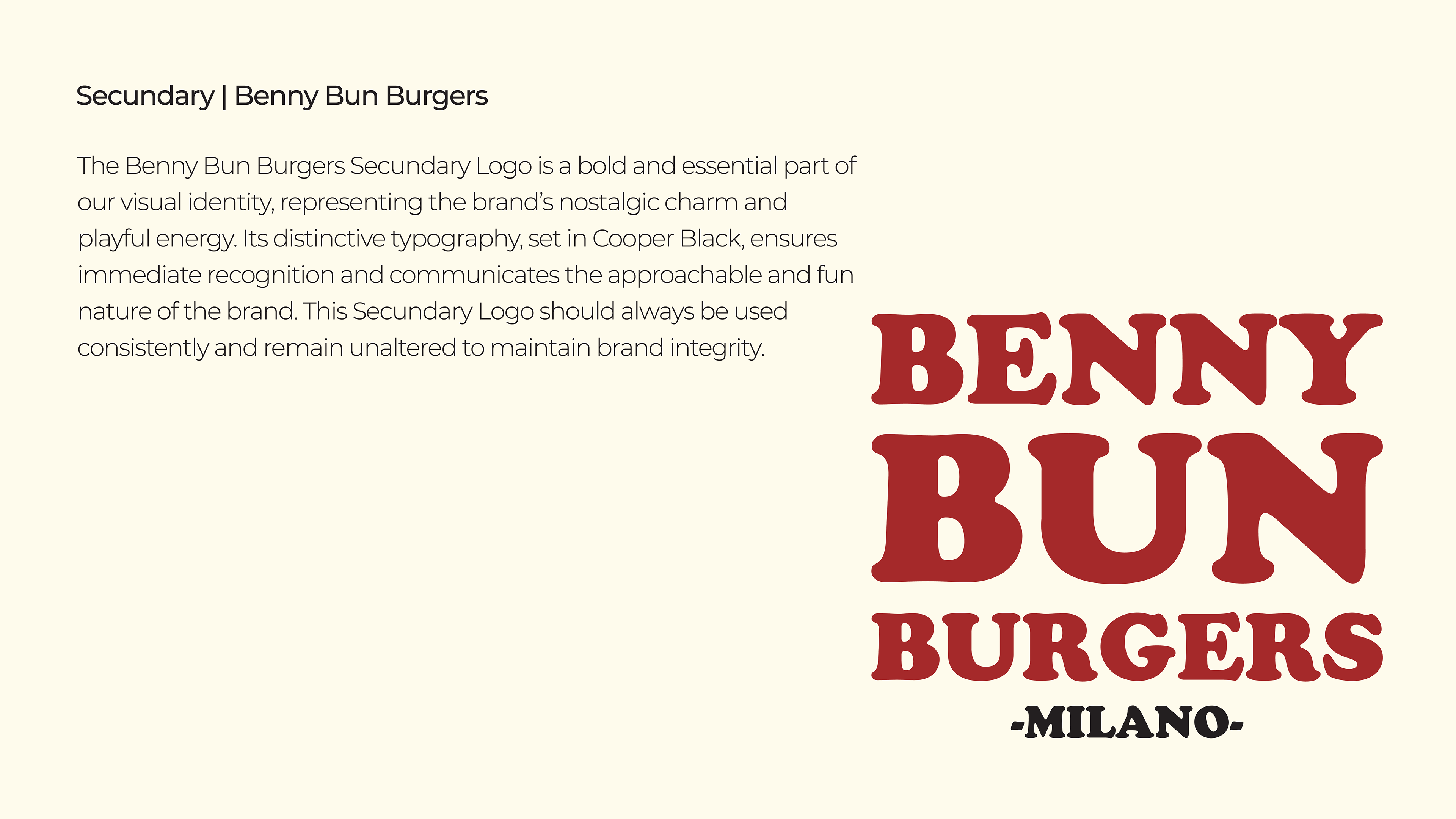
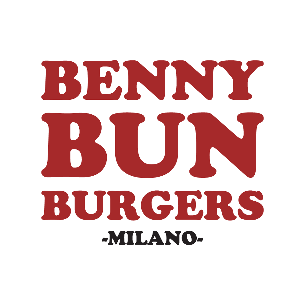
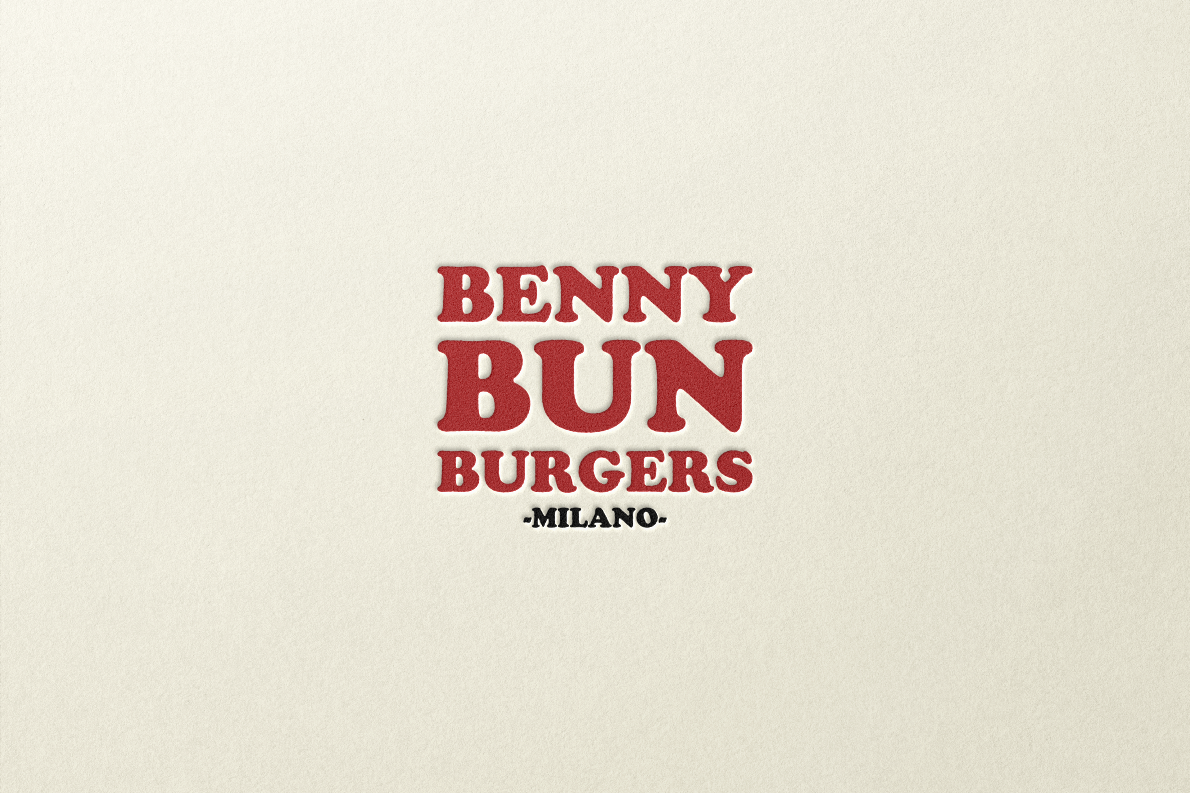
The branding utilizes Cooper Black for the logo, chosen for its nostalgic warmth and bold personality. It is paired with Montserrat as the secondary typeface, ensuring clarity and modernity in supporting text for menus, packaging, and other collateral.
• Color Palette:
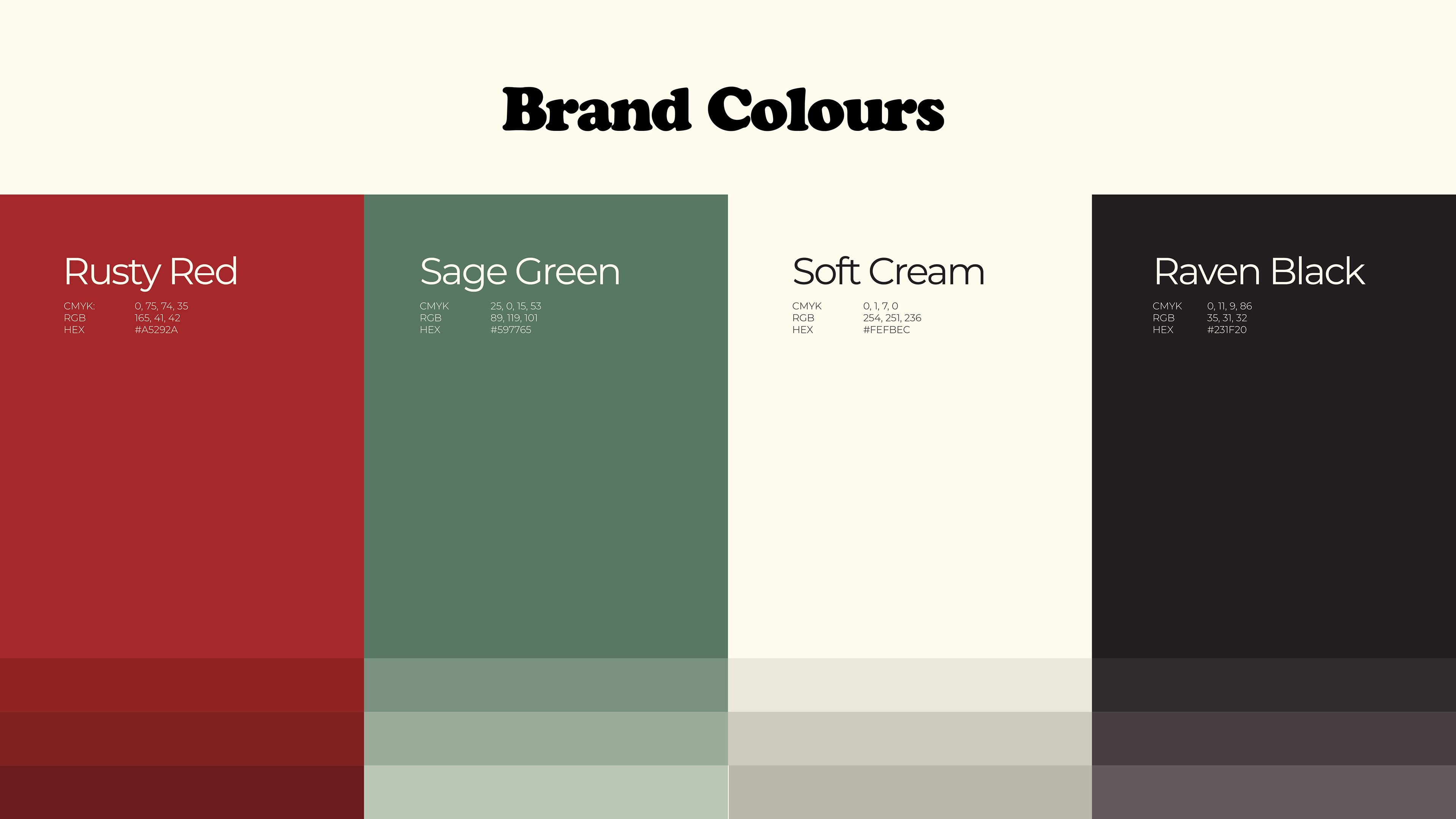
A retro yet inviting palette of Rusty Red, Muted Greens, Cream Whites, and Black, inspired by vintage diners, creates a cohesive look that feels both classic and fresh.
Approach
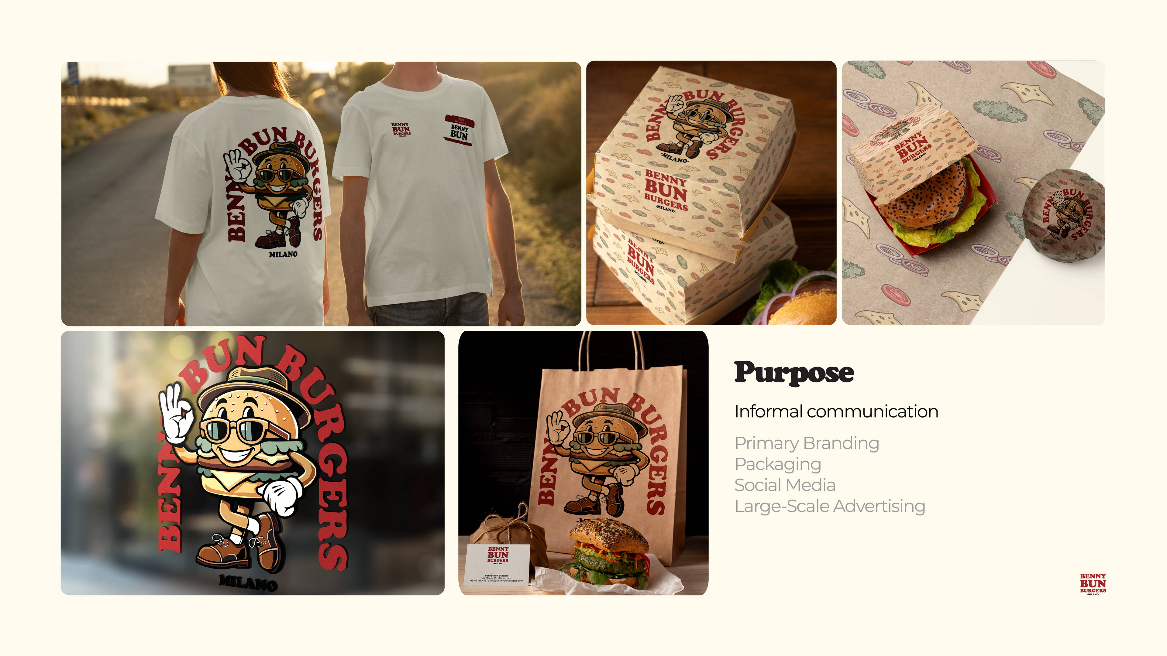
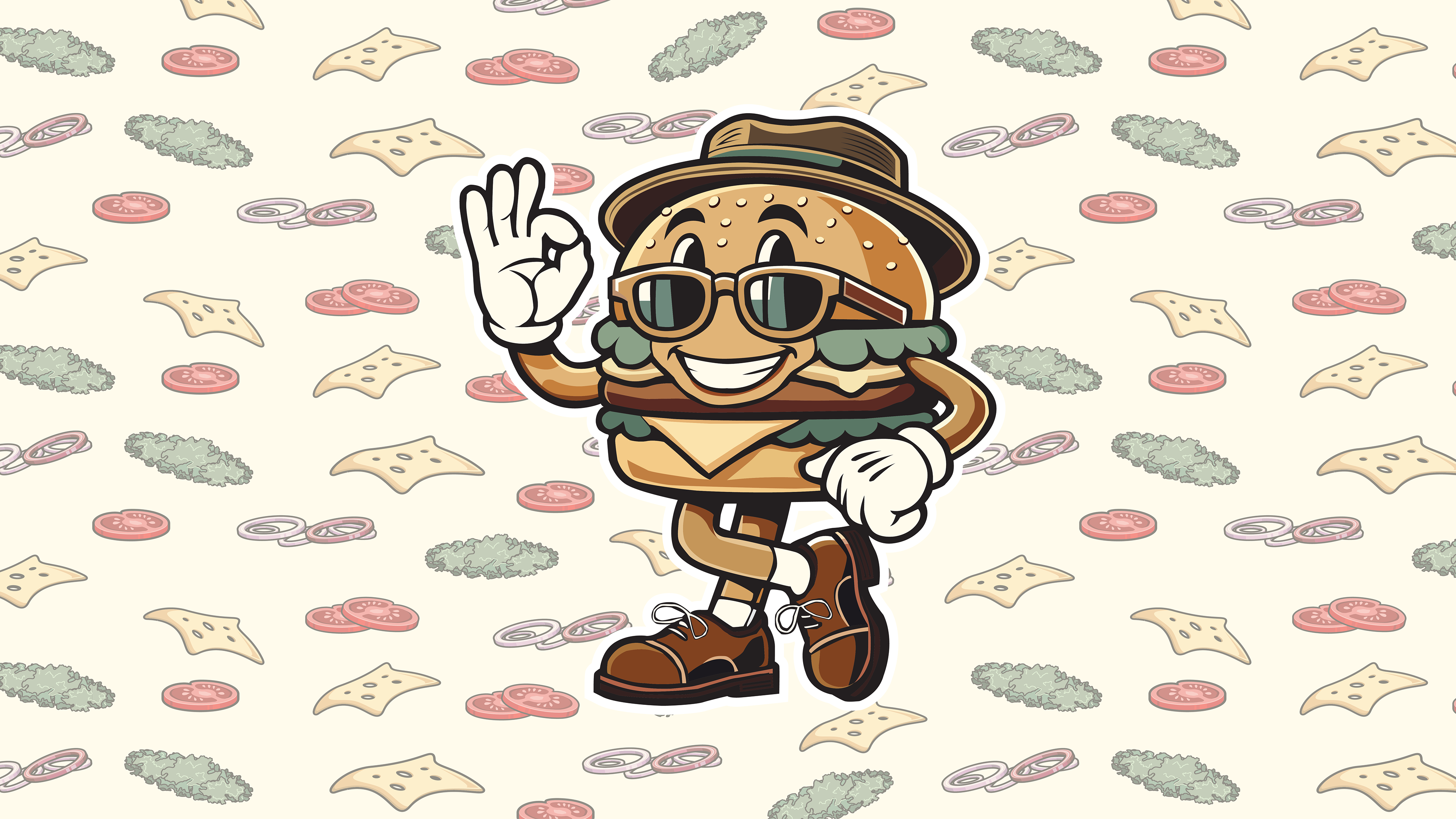
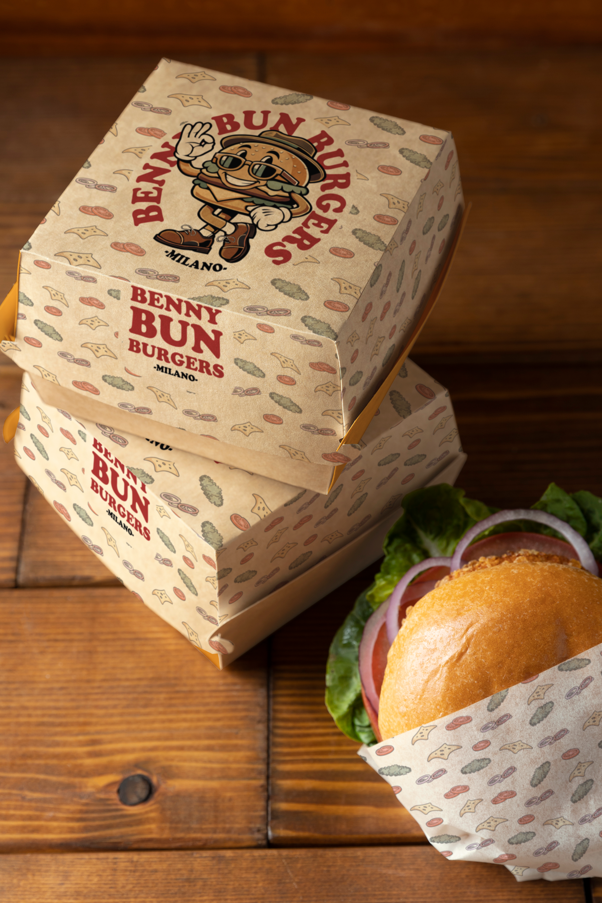
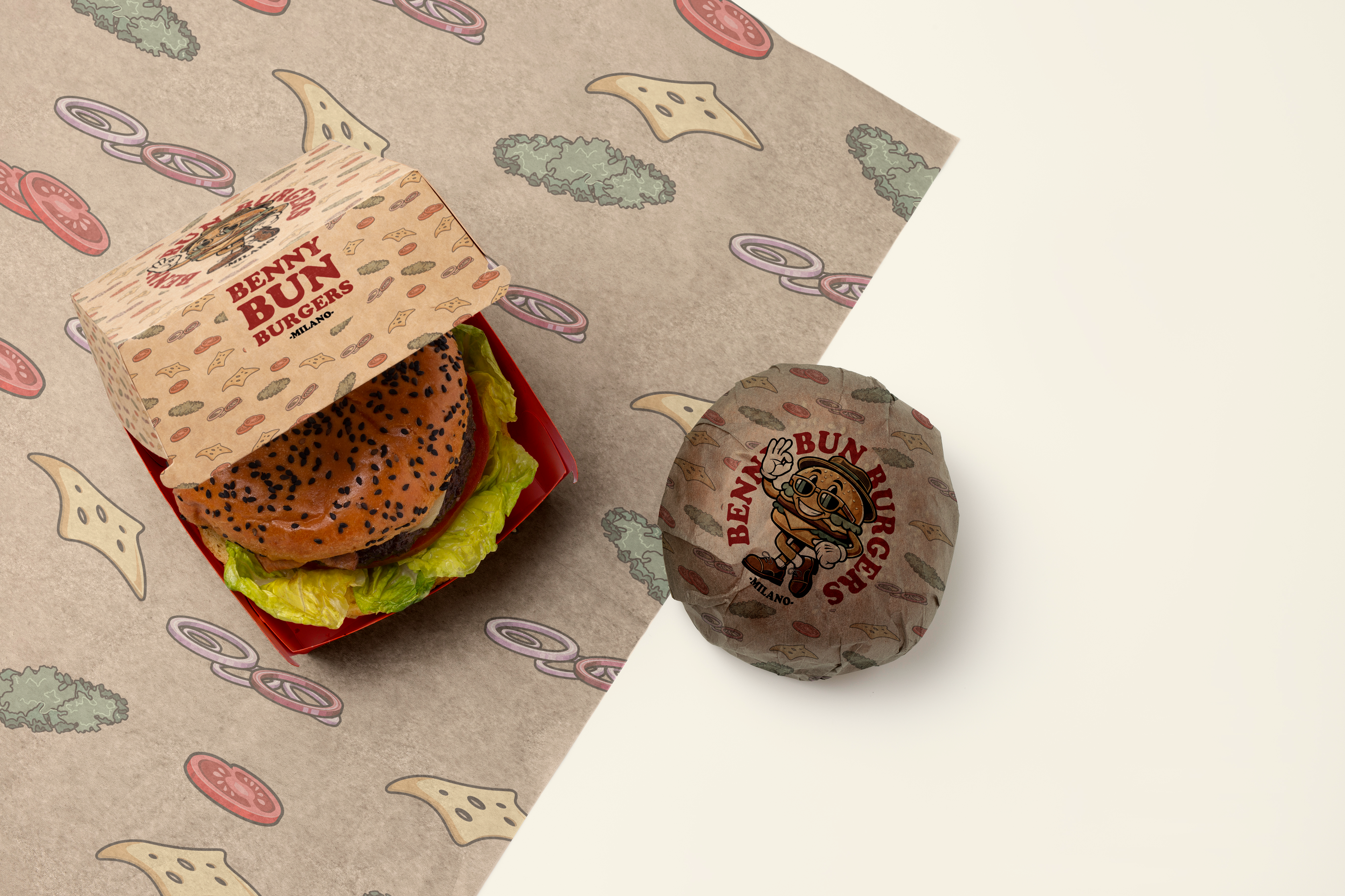
This project centers around the challenge of merging retro aesthetics with modern design principles. Benny Bun, the mascot, provides the playful and nostalgic foundation, while the use of clean typography and structured layouts ensures the brand resonates with today’s audiences. Patterns featuring burger elements, thoughtful use of space, and balanced typography work together to create a professional yet approachable identity.
Outcome
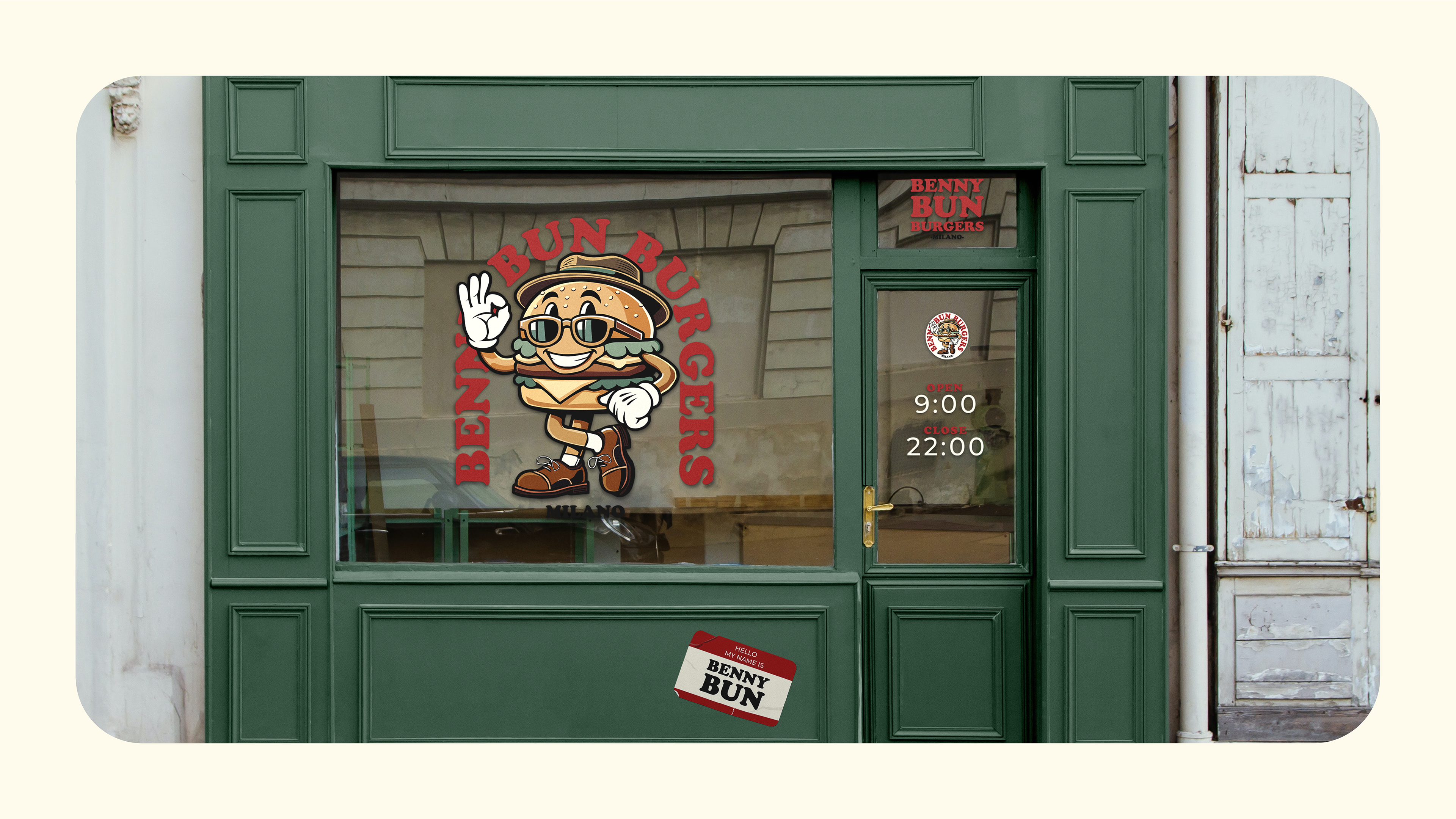
The Benny Bun Burgers branding project successfully blends vintage charm with contemporary aesthetics, resulting in a memorable and versatile identity. By featuring Benny Bun as the face of the brand and integrating retro typography with modern design, the project embodies fun, quality, and a love for great food. The result is a timeless visual system that connects emotionally with customers while standing out in a competitive market.
LOGO
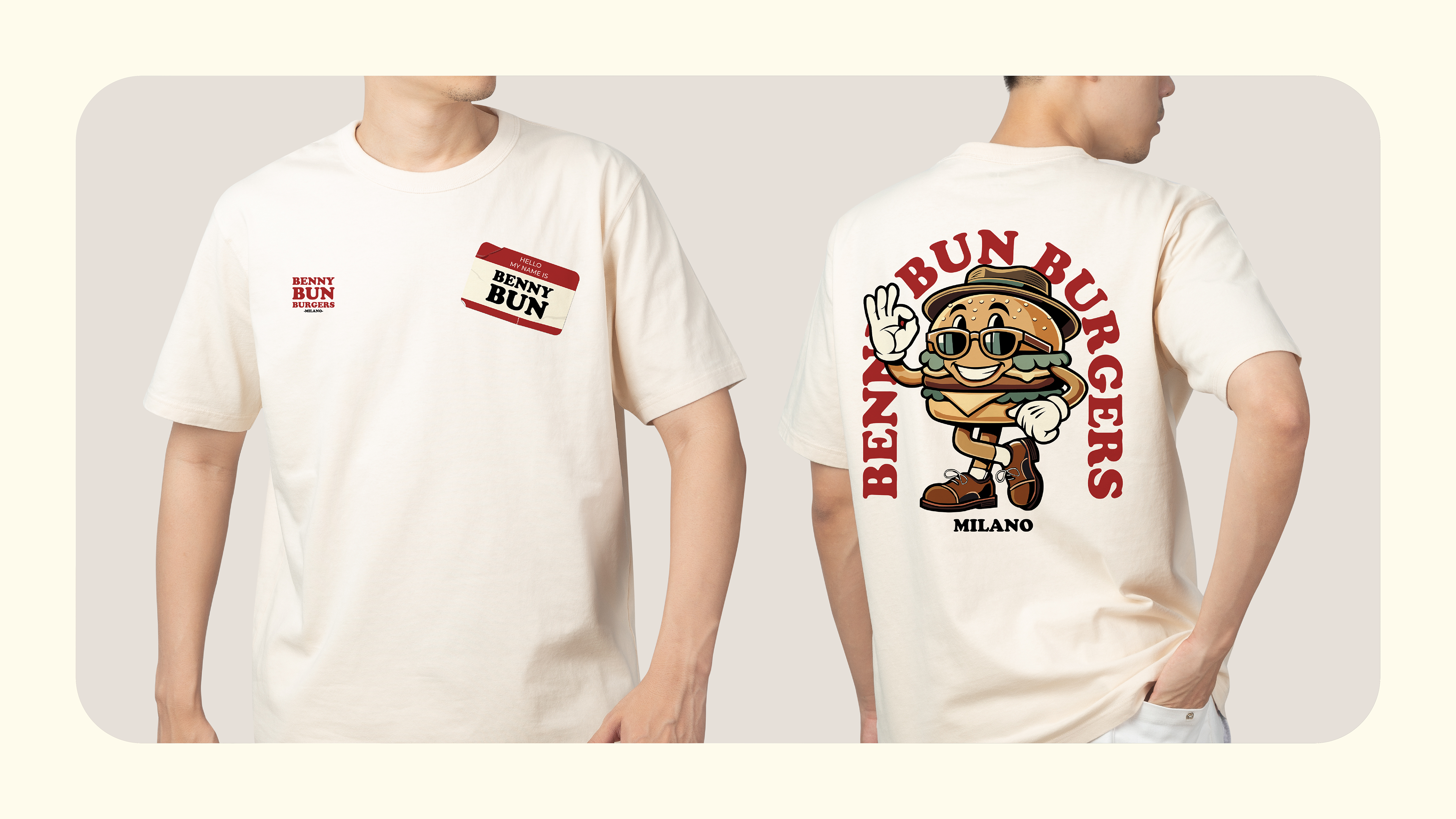
MOCKUPS
BRAND PRESENTATION
