NØ ÅTTA – Scandinavian Coffee
Service: Visual Identity
Client: NØ ÅTTA (Self-Initiated Project)
Year: 2025
Art Direction & Design: Ewan Kroontje
Instagram: @ewan.kroontje
Client: NØ ÅTTA (Self-Initiated Project)
Year: 2025
Art Direction & Design: Ewan Kroontje
Instagram: @ewan.kroontje
Portfolio: www.ewankroontje.com
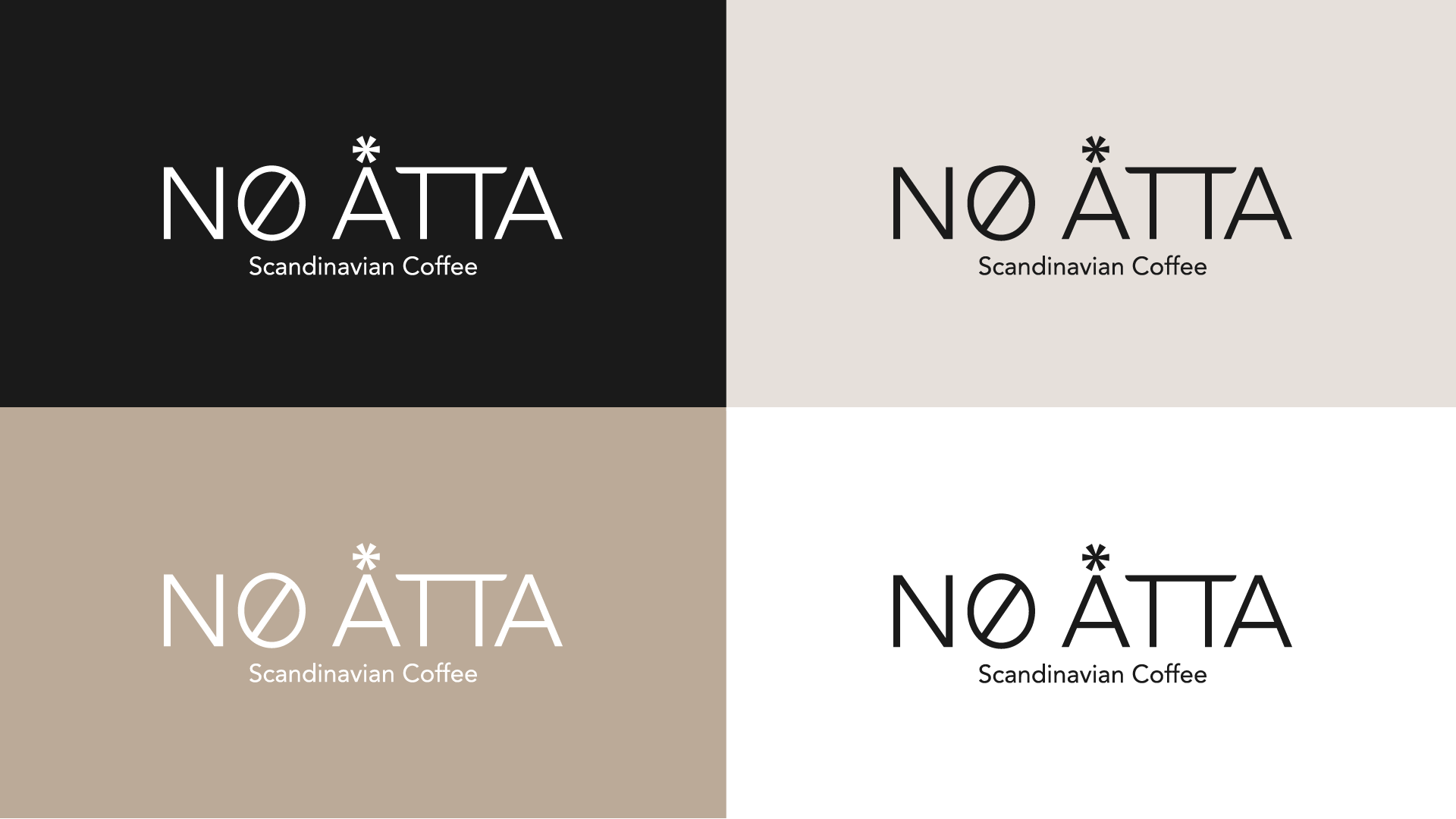
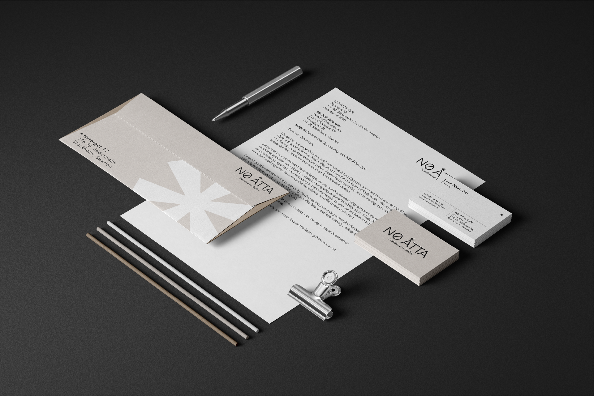
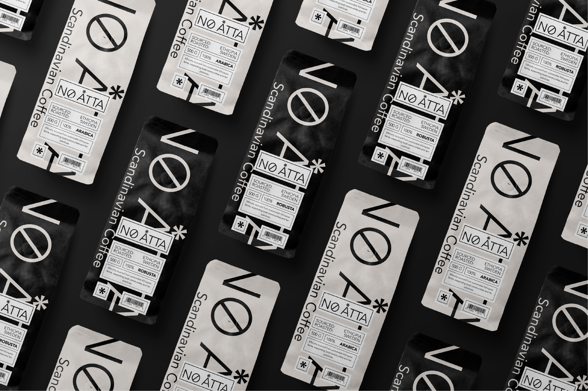
This project focuses on the branding for NØ ÅTTA, a Scandinavian coffee concept. The goal was to design a clean and modern identity inspired by Scandinavian minimalism.
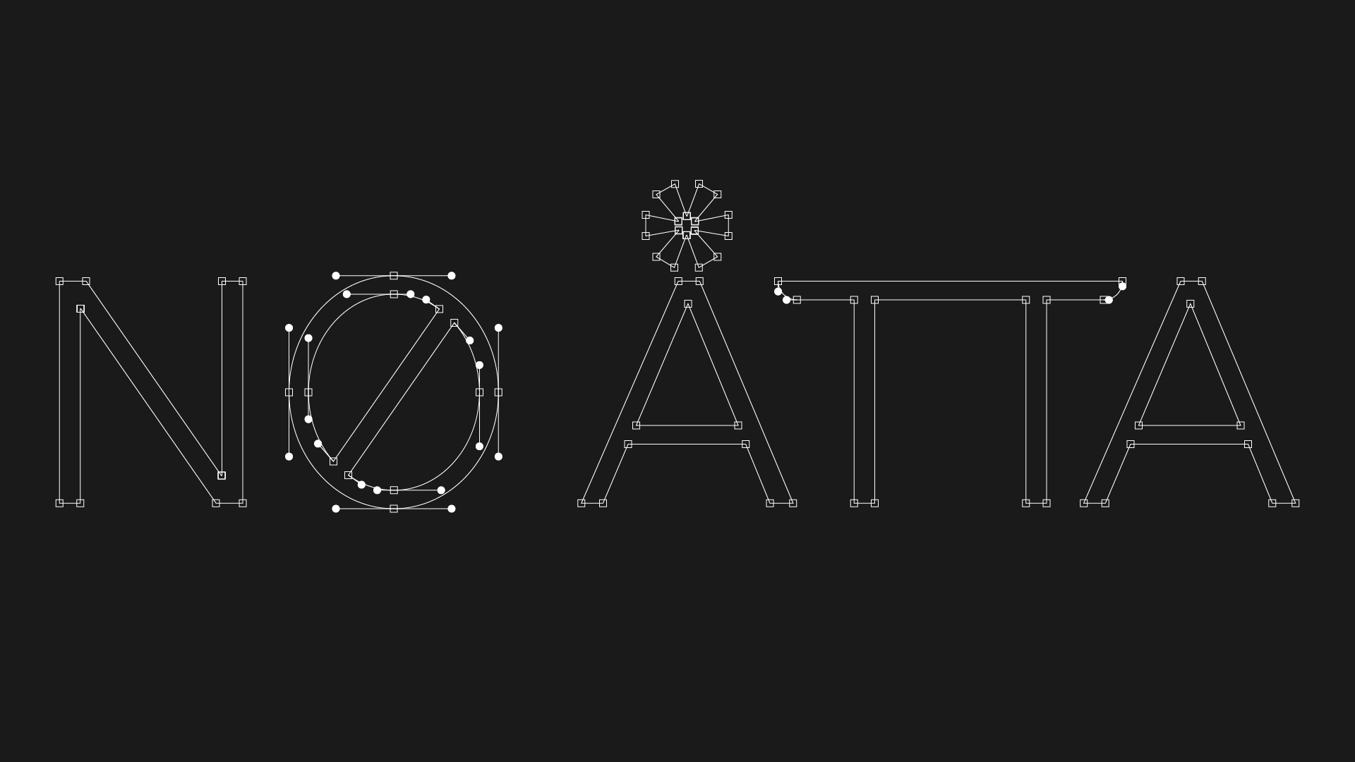
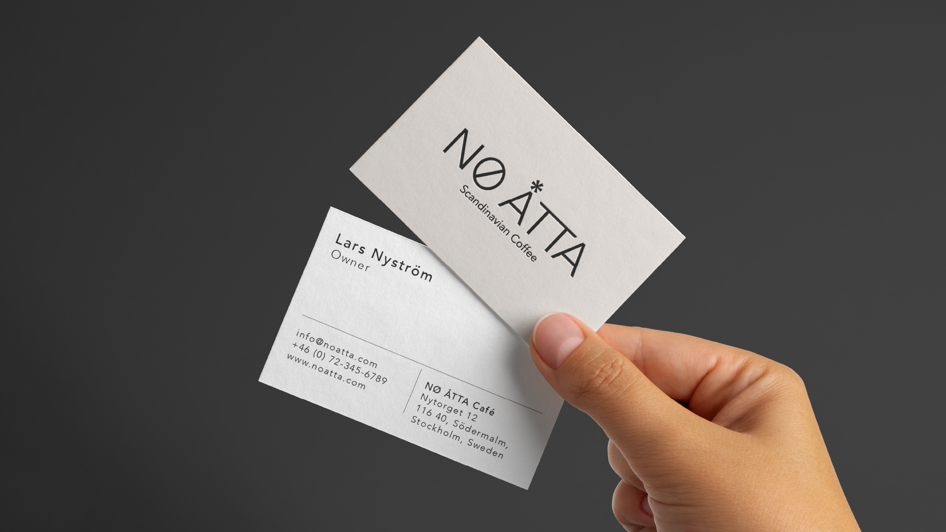
The logo construction reflects intentional design choices. Avenir, a clean and timeless typeface, was used to embody Scandinavian simplicity. Each element of the logo has meaning:
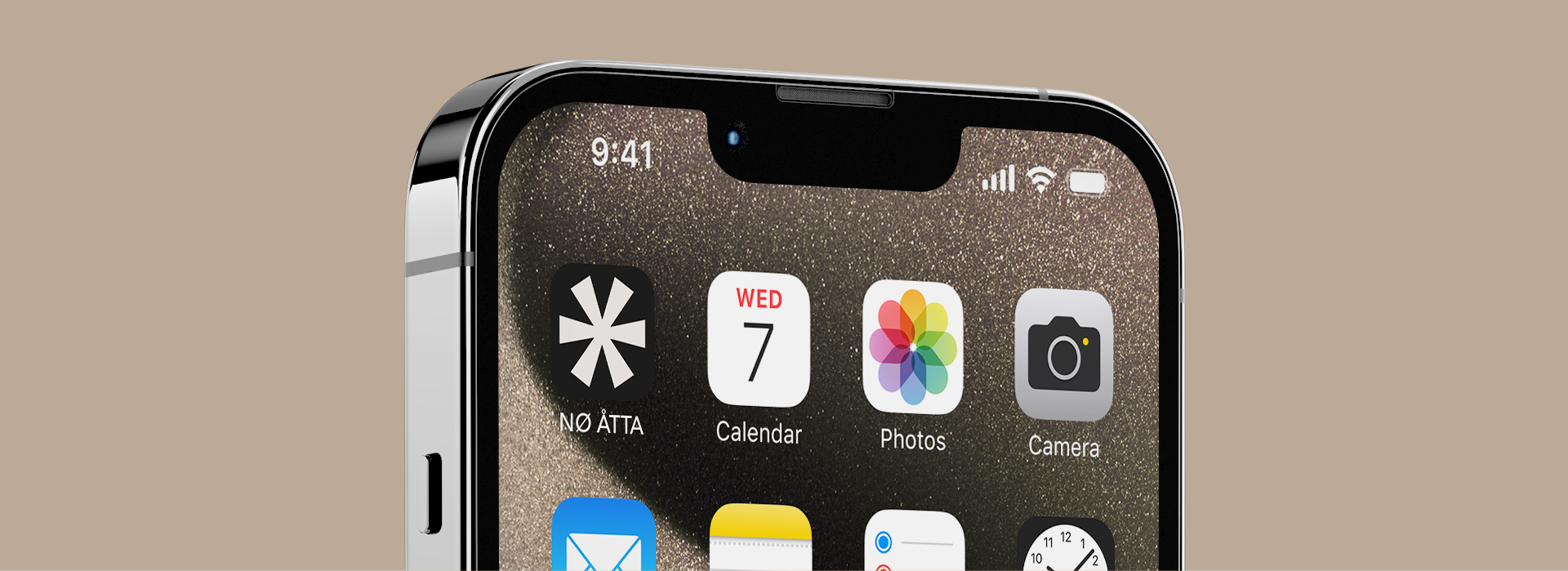
The "Ø" symbolizes a coffee bean, representing the heart of the brand.
The asterisk above the "Å" represents a coffee filter, tying into the brewing process.
The "T" characters are subtly shaped to resemble tables, nodding to the café's inviting atmosphere.


Thank you for viewing!
I hope you enjoyed exploring the NØ ÅTTA visual identity project. If you'd like to collaborate or have any questions, feel free to reach out.